Styling
VP Player offers possibilities to add configuration and . The config object has several properties that allow you to customize the appearance of the player. Here is a brief overview of each property:
Float
The float property in the VP Player configuration allows you to enable a floating version of the player that can be displayed on top of other content on the page. Here is a brief overview of each property in the float object, with additional comments provided:
state: This property controls whether the floating version of the player is enabled or disabled. Set it totrueto enable the floating player, orfalseto disable it.onMobile: This property controls whether the floating version of the player is enabled or disabled on mobile devices. Set it totrueto enable the floating player on mobile devices, orfalseto disable it.position: This property controls where the floating player is displayed on the page. Possible values include "BOTTOM_RIGHT", "BOTTOM_LEFT", "TOP_RIGHT", and "TOP_LEFT".dismissible: This property controls whether the floating player has a close button that allows the user to dismiss it. Set it totrueto enable the close button, orfalseto disable it.requiresInteraction: This property controls whether the player needs interaction (e.g., mouse movement or touch input) to go into floating mode. Set it totrueto require interaction, orfalseto allow the player to go into floating mode without interaction.toVideoThreshold: This property specifies the threshold at which the player will return to the normal (non-floating) video state. It is a value between 0 and 1, where 0 means the player will return to the normal state as soon as the user moves the mouse away from the player, and 1 means the player will remain in the floating state until the user explicitly dismisses it.toFloatThreshold: This property specifies the threshold at which the player will go into floating mode. It is a value between 0 and 1, where 0 means the player will go into floating mode as soon as the user moves the mouse over the player, and 1 means the player will remain in the normal state until the user explicitly activates the floating mode.style: This property allows you to customize the appearance of the floating player. Thewidthproperty specifies the width of the player in pixels, and theborderproperty specifies the color of the border around the player.
vpPlayer("vp-player-float").setup({
    video: {
        file: "the_video_file_path"
    },
    config: {
        float: {
            state: true,
            onMobile: false,
            position: "BOTTOM_RIGHT",
            dismissible: true,
            requiresInteraction: false,
            toVideoThreshold: 0.35,
            toFloatThreshold: 0.2,
            style: {
                width: 300,
                border: "#fff",
            },
        },
    }
});
| PROPERTY | DESCRIPTION |
|---|---|
| float Object | An object that specifies the properties of floating. |
| state Boolean | Specifies the state of float. By default is false. |
| onMobile Boolean | Specifies if float should be activated when player is opened on mobile devices. |
| positionstring | Specifies the position of floating player. It has 4 values: bottomLeft, bottomRight, upperLeft, upperRight. |
| dismissible Boolean | Determines if the user can dissmiss the floating player. |
| toFloatThreshold int | This integer represents the viewport height percentage of when the video will go to the float state (values from 0-1). |
| toVideoThreshold int | This integer represents the viewport height percentage the video needs to be in order to escape the float state (values 0-1). |
| style Object | Styling attributes about the floating player. |
| width Number | Specifies the width of the floating player. |
| borderstring | Configures the color of the border. |
| requiresInteraction Boolean | Speceifies if the player needs use interaction in order to be considered for floating. |
To specify a specific position for the floating container, you can create a custom <div> element with an id of vp-floating-container.
Controls
The controls property in the VP Player configuration allows you to enable or disable various player controls that are displayed in the control bar. Here is a brief overview of each property in the controlsobject, with additional comments provided:
settingsButton: This property controls whether the settings button is displayed in the control bar. The settings button allows the user to access options such as video quality, speed control, and subtitles. Set it totrueto enable the settings button, orfalseto disable it.chromecastButton: This property controls whether the Chromecast button is displayed in the control bar. The Chromecast button allows the user to cast the video to a Chromecast device. Set it totrueto enable the Chromecast button, orfalseto disable it. Note that the button will only be displayed if a Chromecast device is available.nextButton: This property controls whether the next button is displayed in the control bar. The next button will play the next video in the playlist, or trigger thevp-nextevent if no playlist is available. Set it totrueto enable the next button, orfalseto disable it.fullscreenButton: This property controls whether the fullscreen button is displayed in the control bar. The fullscreen button allows the user to toggle fullscreen mode on and off. Set it totrueto enable the fullscreen button, orfalseto disable it.airplayButton: This property controls whether the AirPlay button is displayed in the control bar. The AirPlay button allows the user to cast the video to an Apple TV or other AirPlay-compatible device. Set it totrueto enable the AirPlay button, orfalseto disable it.bigPlayButton: This property controls whether the big play button is displayed in the control bar. The big play button is a large button that calls attention to the player and allows the user to start playing the video. Set it totrueto enable the big play button, orfalseto disable it.pictureInPictureButton: This property controls whether the picture-in-picture button is displayed in the control bar. The picture-in-picture button allows the user to play the video in a separate, floating window that can be positioned over other content on the page. Set it totrueto enable the picture-in-picture button, orfalseto disable it.relatedButton: This property controls whether the related button is displayed in the control bar. The related button allows the user to access a playlist of related videos. Set it totrueto enable the related button, orfalseto disable it.volumeButton: This property controls whether the volume button is displayed in the control bar. The volume button allows the user to adjust the volume of the video. Set it totrueto enable the volume button, orfalseto disable it.shareButton: This property controls whether the share button is displayed in the control bar. The share button allows the user to access options for sharing the video on social media or via a link. Set it totrueto enable the share button, orfalseto disable it. The social networks shown in the share menu are configured through theconfig.socialMediaarray — all-capital strings with the official social media names, e.g.["FACEBOOK", "LINKEDIN", "REDDIT"]. If the array is left empty, the share options won't be available.
vpPlayer("vp-player-controls").setup({
    video: {
        file: "the_video_file_path"
    },
    config: {
        controls: {
            settingsButton: true,
            chromecastButton: false,
            nextButton: true,
            fullscreenButton: true,
            airplayButton: true,
            bigPlayButton: true,
            pictureInPictureButton: false,
            relatedButton: true,
            volumeButton: true,
            shareButton: true,
        },
    }
});
| PROPERTY | DESCRIPTION |
|---|---|
| controls Object | Object with keys that specify which control buttons should appear in the UI. |
| theaterButton Boolean | Configures the property that the player uses to determine if it should request theater mode on init. |
| settingsButton Boolean | Determines whether the settings button is shown. |
| chromecastButton Boolean | Determines whether the cast button is shown. |
| nextButton Boolean | Specifies whetther the next button is shown. |
| fullscreenButton Boolean | Specifies whether the fullscreen button is shown. |
| airplayButton Boolean | Specifies whether the airplay button is shown. |
Logo
The logo property in the VP Player configuration allows you to display a logo in the player. Here is a brief overview of each property in the logo object, with additional comments provided:
state: This property controls whether the logo feature is enabled or disabled. Set it totrueto enable the logo, orfalseto disable it.file: This property specifies the path to the logo file. The file should be a PNG or SVG image.position: This property specifies the position of the logo in the player. Possible values areTOP_RIGHT,TOP_LEFT,BOTTOM_RIGHT,BOTTOM_LEFT, andCONTROL_BAR.defaultOpacity: This property specifies the default (active) opacity of the logo. The value should be a number between 0 and 1, with 0 being completely transparent and 1 being completely opaque.inactiveOpacity: This property specifies the inactive opacity of the logo. The value should be a number between 0 and 1, with 0 being completely transparent and 1 being completely opaque. The inactive opacity is used when the player is in fullscreen mode or when the controls are not displayed.onClickURL: This property specifies a URL that will be opened when the logo is clicked. If no URL is specified, the logo will not be clickable.
vpPlayer("vp-player-logo").setup({
    video: {
        file: "the_video_file_path"
    },
    config: {
        logo: {
            state: false,
            file: "the_logo_file_path",
            position: "TOP_RIGHT",
            defaultOpacity: 1,
            inactiveOpacity: 0.5,
            onClickURL: "the_url_when_cliekced",
        },
    }
});
| PROPERTY | DESCRIPTION |
|---|---|
| logo Object | An object which holds the properties of the logo. |
| file string | Link to the logo which will be displayed. |
| positon string | Specifies the position of the logo, (TOP-RIGHT, TOP-LEFT, BOTTOM-RIGHT, BOTTOM-LEFT). |
| defaultOpacity Number | Value range: 1-0, determines the opacity of the logo when its active. |
| inactiveOpacity Number | Value range: 1-0, determines the opacity of the logo when its inactive. |
| onclickURL string | Specifies the link to go to when the logo is clicked. |
Skin
The skin property in the VP Player configuration allows you to customize the look and feel of the player. It consists of four main sections: controlBar, menus, nextVideo, and playlist.
The controlBar object in the configuration is used to customize the appearance of the control bar of the video player. The control bar is the bar that typically appears at the bottom of the player and contains buttons for controlling the video, such as play/pause, fullscreen, volume, and more.
Here are the properties that can be customized in the controlBar object:
background: This property specifies the background color of the control bar. You can use a hexadecimal color code, a named color, or a RGB/RGBA value to specify the background color.spread: This property determines the type of gradient to be used for the control bar background. The possible values are "solid" and "gradient". If "solid" is chosen, the control bar will have a solid color background. If "gradient" is chosen, the control bar will have a gradient background that transitions between two colors.gradientMidPoint: This property is only applicable if thespreadproperty is set to "gradient". It specifies the midpoint of the gradient, as a percentage value. For example, a value of 50 means that the gradient will transition from the start color to the end color at the midpoint of the control bar.text: This property specifies the color of the text (such as the time displayed in the control bar) and icons in the control bar.icons: This object allows you to customize the appearance of the icons in the control bar. Thedefaultproperty specifies the color of the icons when they are not being hovered over, and thehoverproperty specifies the color of the icons when they are being hovered over.timeslider: This object allows you to customize the appearance of the timeslider in the control bar. The timeslider is the bar that shows the progress of the video and allows the user to seek to a different point in the video by dragging the cursor. Theprogressproperty specifies the color of the portion of the timeslider that represents the portion of the video that has been played. Therailproperty specifies the color of the entire timeslider. Thebufferproperty specifies the color of the portion of the timeslider that represents the portion of the video that has been loaded but not yet played. Thedraggerproperty specifies the color of the cursor that can be dragged to seek to a different point in the video.timesliderOnAd: This object has the same properties as thetimesliderobject, but they are applied to the timeslider when an ad is being played.volumeproperty allows you to customize the appearance of the volume control in the control bar of the player. It includes the following properties:dragger: the color of the volume slider handle,progress: the color of the volume level indicator,rail: the color of the volume slider track,notifier: the color of the volume notification (e.g., the volume percentage that appears when adjusting the volume).
The menus property of the skin configuration object is used to customize the appearance of the menus in the video player.
background: This property is an object that allows you to customize the background color of the menus. Thedefaultfield sets the color of the background.links: This property is an object that allows you to customize the color of the links in the menus. Thedefaultfield sets the default color of the links, while thehoverfield sets the color when the link is hovered over by the mouse.autoplay: This property is an object that allows you to customize the color of the autoplay toggle in the menus. TheautoplayOnfield sets the color when autoplay is enabled, while theautoplayOfffield sets the color when autoplay is disabled.
The nextVideo object in the skin configuration object allows you to customize the appearance of the next video popup that appears when a video ends and the player is set to automatically play the next video in a playlist.
background: property specifies the background color of the popup. Thetextproperty specifies the color of the text within the popup.timeslider: object withinnextVideoallows you to customize the appearance of the timeslider within the popup. Therailproperty specifies the color of the entire timeslider, while theprogressproperty specifies the color of the portion of the timeslider that represents the progress of the next video that is being previewed.iconsobject withinnextVideoallows you to customize the appearance of the play and close icons within the popup. Theplayobject hasdefaultandhoverproperties that allow you to specify the color of the play icon when it is not being hovered over and when it is being hovered over, respectively. Thecloseproperty specifies the color of the close icon.
The playlist property in the skin object allows you to customize the appearance of the playlist, which is typically displayed in a separate window or panel within the video player.
The playlist property has the following sub-properties:
background: This property specifies the background color of the playlist. It should be a valid CSS color value, such as a hexadecimal color code or a color keyword.text: This property specifies the color of the text within the playlist. It should be a valid CSS color value.icons: This property allows you to customize the appearance of the icons in the playlist. It has two sub-properties:arrows: This property allows you to customize the appearance of the arrow icons that are used to navigate through the playlist. It has two sub-properties:active: This property specifies the color of the arrow icons when they are being hovered over or clicked on. It should be a valid CSS color value.inactive: This property specifies the color of the arrow icons when they are not being hovered over or clicked on. It should be a valid CSS color value.
close: This property specifies the color of the close icon that is used to close the playlist. It should be a valid CSS color value.
card: This property allows you to customize the appearance of the cards that are used to display the individual videos in the playlist. It has the following sub-properties:background: This property specifies the background color of the cards. It should be a valid CSS color value.title: This property specifies the color of the title text within the cards. It should be a valid CSS color value.duration: This property allows you to customize the appearance of the duration text within the cards. It has two sub-properties:text: This property specifies the color of the duration text. It should be a valid CSS color
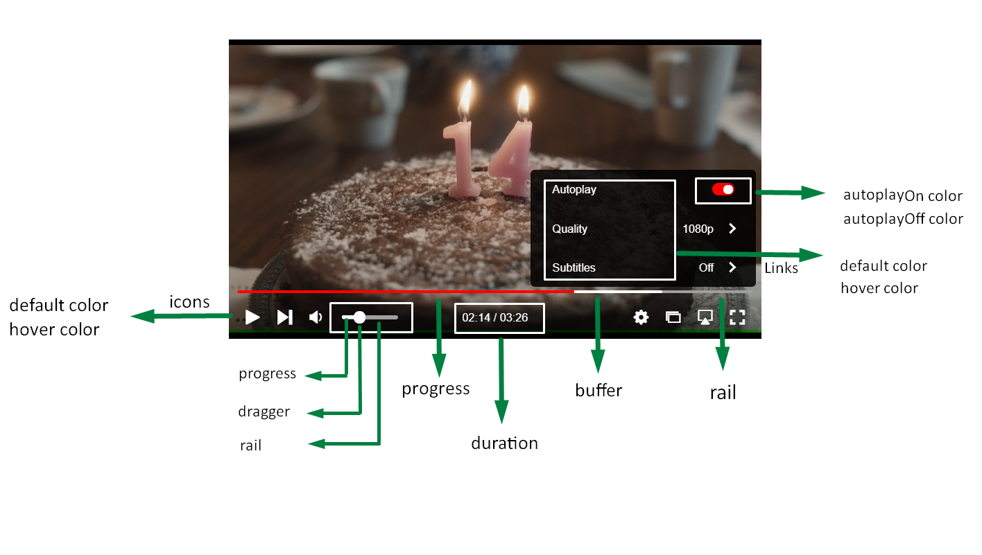
The image is desgined to help you understand exactly what each property is referring to in relation with the actual player itself.
| PROPERTY | DESCRIPTION |
|---|---|
| skin Object | Object that configures the color of each element in player. |
| controlBar Object | Object that configures the color of elements in control bar. |
| background string | Configures the color of the background. |
| text string | Configures the color of the text. |
| icons Object | Specifies the color of icons for buttons in player such as Pause/Play, Volume and Settings button. |
| default string | The default color of mentioned icons. |
| hover string | The color when mouse is hovering over the icons. |
| timeSlider Object | Configures the color of the parts in player's seek bar. |
| progress string | Color of the part in seek bar that represents the watched video. |
| rail string | Color of the part in seek bar that represents the unbuffered part and also the unwatched part. |
| buffer string | Color of the part in seek bar that represents the buffered video. |
| dragger string | Color of the pointer in seek bar. |
| volume Object | Configures color of the seek bar that indicates the volume level. |
| dragger string | Color of the pointer in volume seek bar. |
| progress string | Color of the part in volume seek bar that represents the level of volume. |
| rail string | Color of the volume seek bar from the pointer to the end of volume seek bar. |
| notifier string | Configures the color of the button that shows whether video is muted. |
| timeSliderOnAd Object | Configures the color of the parts in player's seek bar when ad is playing. |
| progress string | Color of the part in seek bar that represents the watched ad. |
| rail string | Color of the part in seek bar that represents the unbuffered part and also the unwatched part of the video. |
| dragger string | Color of the pointer in seek bar when ad is playing. |
| menus Object | Configures the links of Settings. |
| background Object | Configures the color of background. |
| defaultstring | The default color of the background. |
| links Object | Links represent the options that are offered by the settings button : Autoplay, Quality and Subtitles. |
| default string | The default color of the Options Autoplay, Quality also the color of dropdown options of them. |
| hover string | Color when mouse is hovering over text. |
| autoplay Object | Configures the color of the Autoplay toogle. |
| autoplayOn string | Color of toggle when Autoplay is on. |
| autoPlayOff string | Color of toggle when Autoplay is off. |