Designer Components
About Page
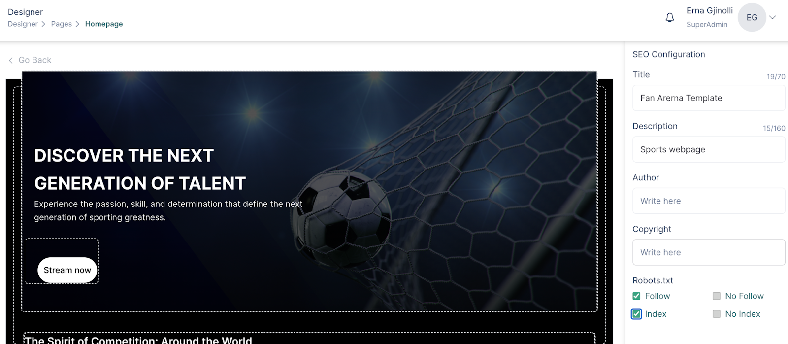
Every created page has an “About Page” section where the following settings can be found:
Page color, with the option to choose a solid or gradient background
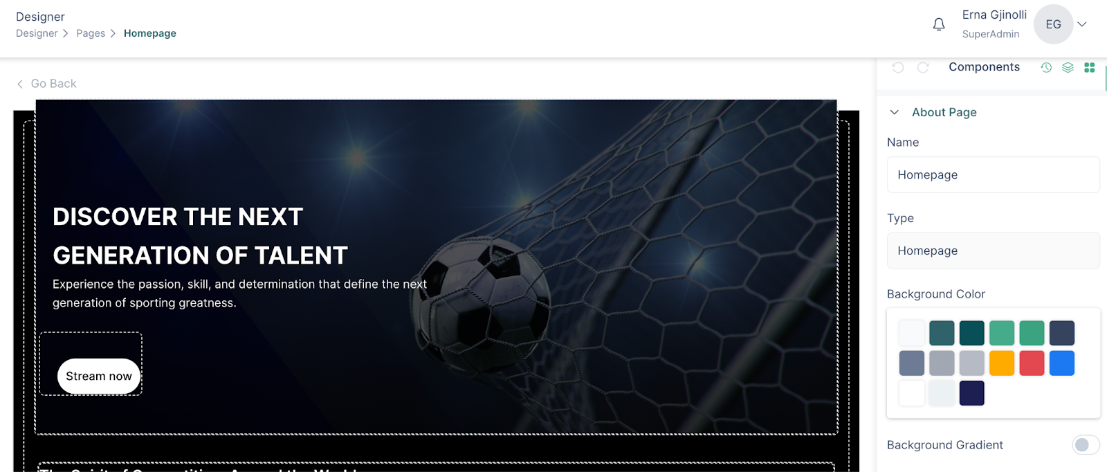
And the SEO configuration section
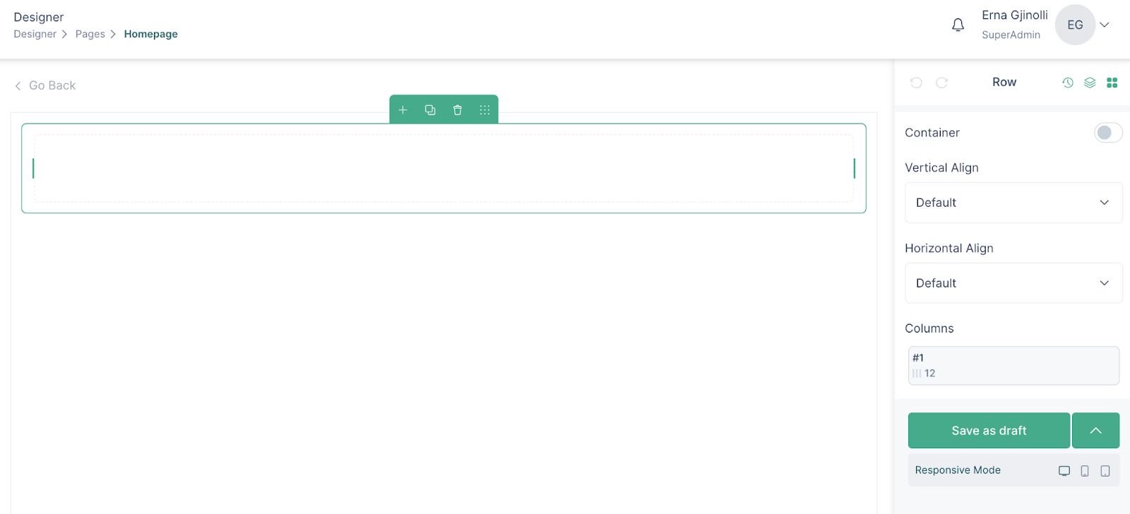
Rows
Building pages always starts off with the rows. To add a row, drag and drop the Row component from the UI Components section.
Rows have a container setting which can be enabled or disabled. This enables proper spacing between page content and the edge of the browser.
Rows can be moved within the page (up and down) via the drag and drop functionality.
Column
Once a row is added to a page, multiple layout suggestions appear. Up to 6 columns can be added within a row.
Margin and padding are properties of the columns which can then be set up based on the user’s preferences.
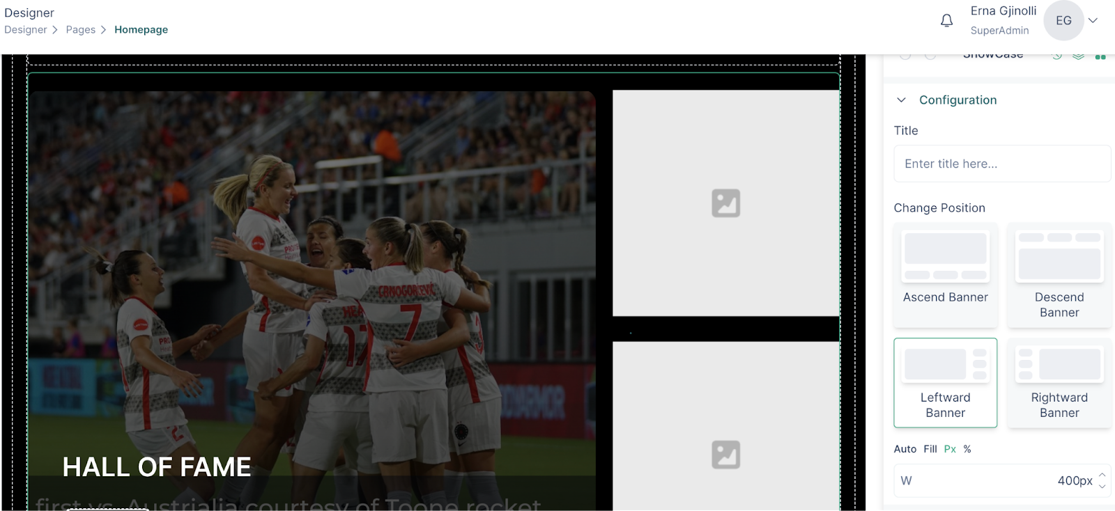
Banner
Static banner
Banners can enhance the visual appeal of a webpage, they will capture the user's attention and can be used to feature important branding elements or important announcements
Here’s how you create a banner for your page:
- Go to a page via the designer in VP Apps admin
- Insert a row and then add a column
Depending on your website design you might want to enable/disable the container.
- Click on the components icon on the right side of the page and drag the banner component inside the column
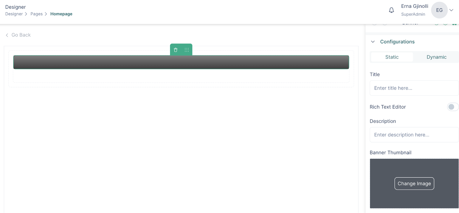
- Click on the banner to see its configuration and styling options
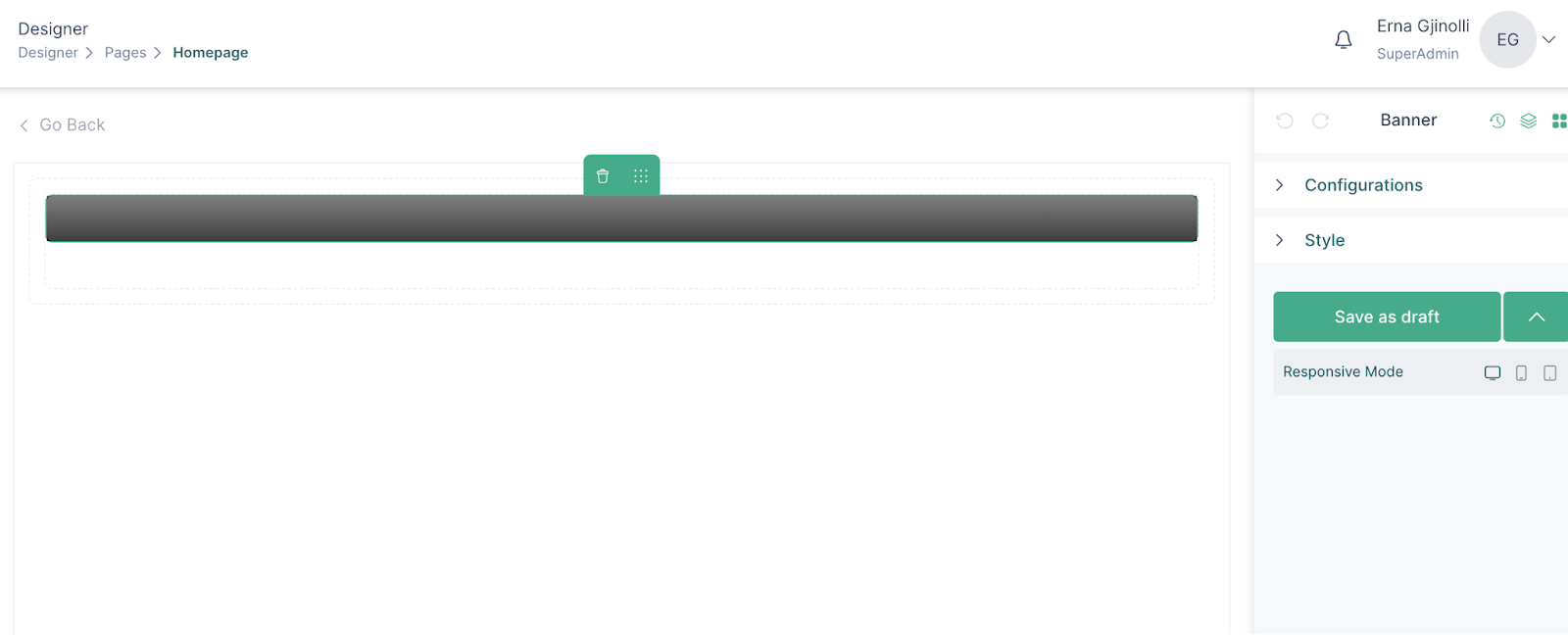
- In the configuration section, select the static option
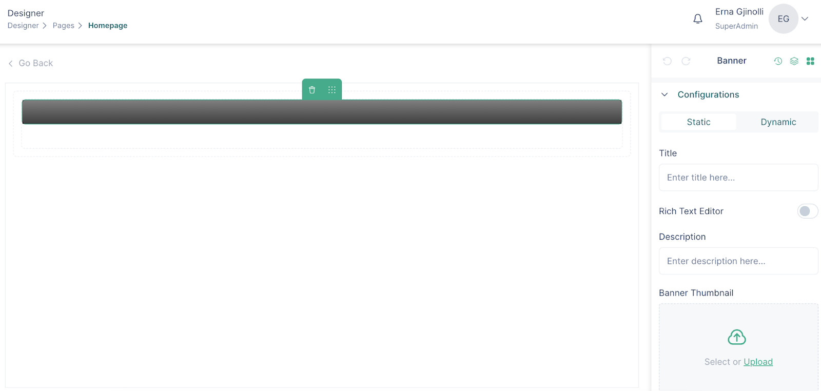
- Insert the image
- You can also insert a video on your banner, by enabling the Video option
- If you have inserted a video, you can also set the Autoplay setting for the banner and you can choose between having and not having the audio controls over the banner
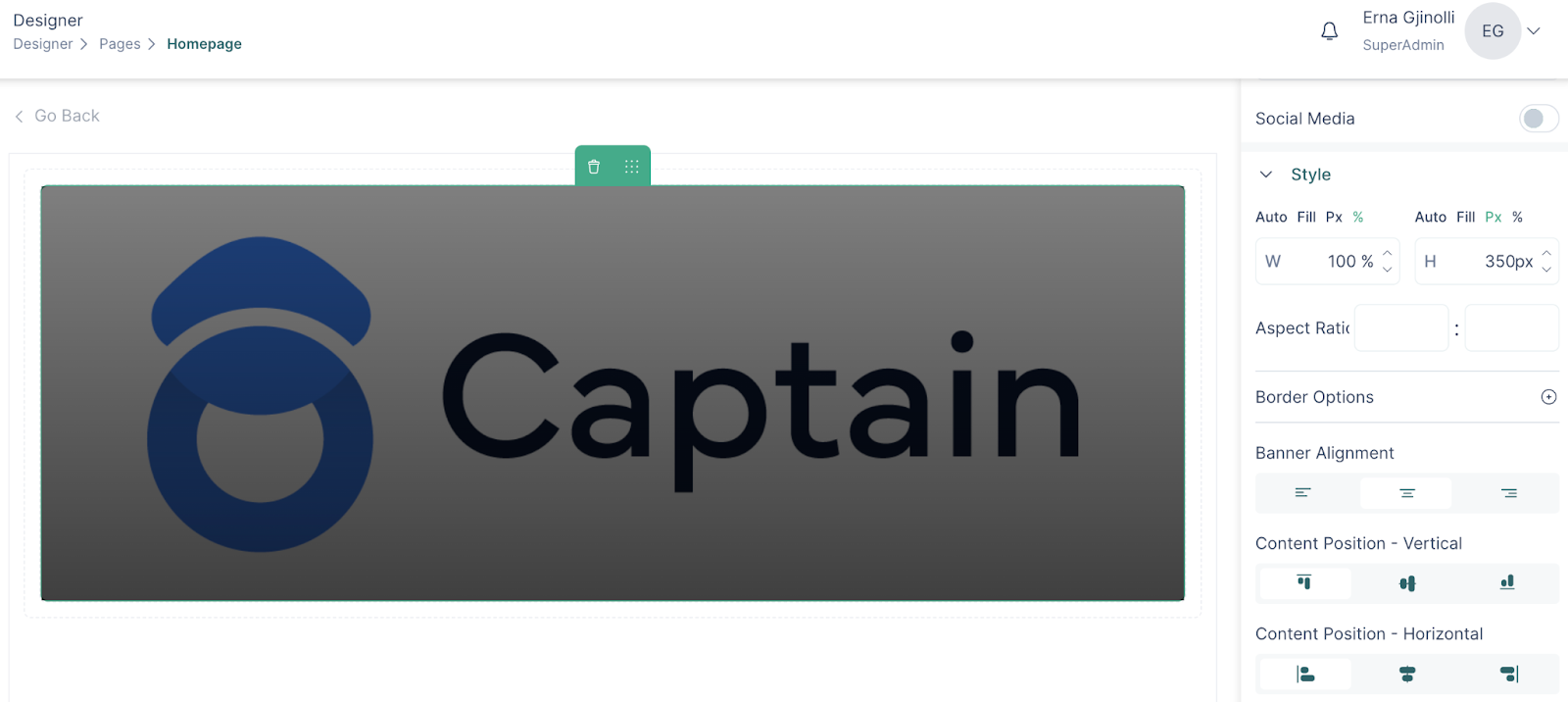
- In the styling section, set the width and height for the banner
- If you want, you can add a title and a description on your banner
- Click on the border options to add and color borders of your banners
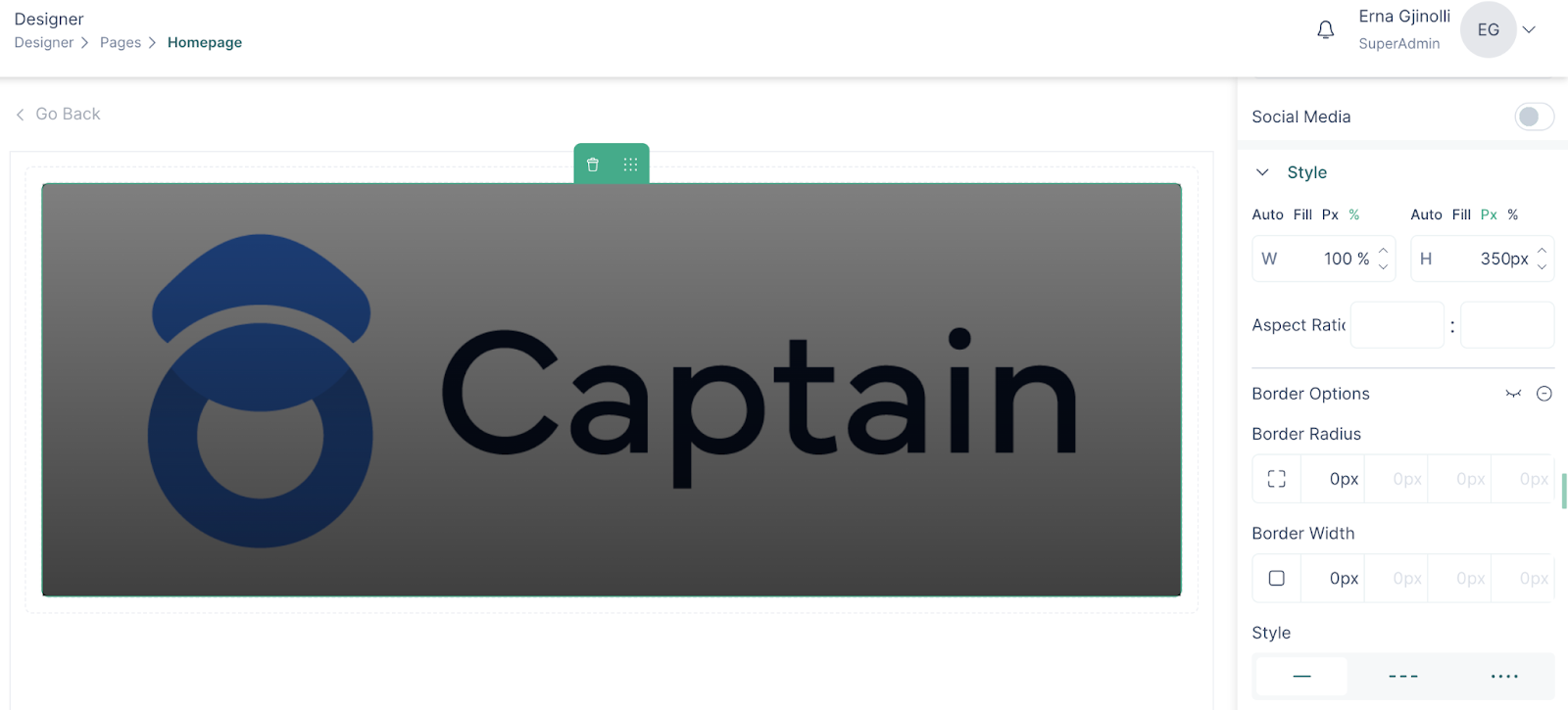
- Further styling options can be found for different components of the banner
- You can edit your banner anytime, remember to click Save and Publish on the page so that the banner is updated
Dynamic banner
A dynamic banner is a banner that will be applied to all pages based on the chosen content.
To create a banner follow these steps:
- Insert a banner on the page
- On the banner configuration section, choose dynamic
- Select the group and the content to which the banner will be displayed
- Enable the context based option and select the components which will be shown on the banner
- Click save
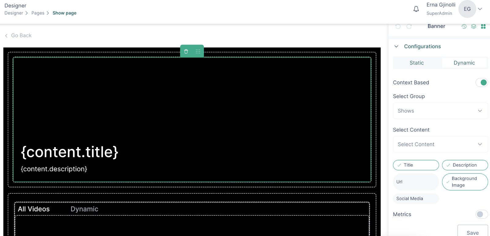
Below there are examples of shows which have a dynamic banner on their content page
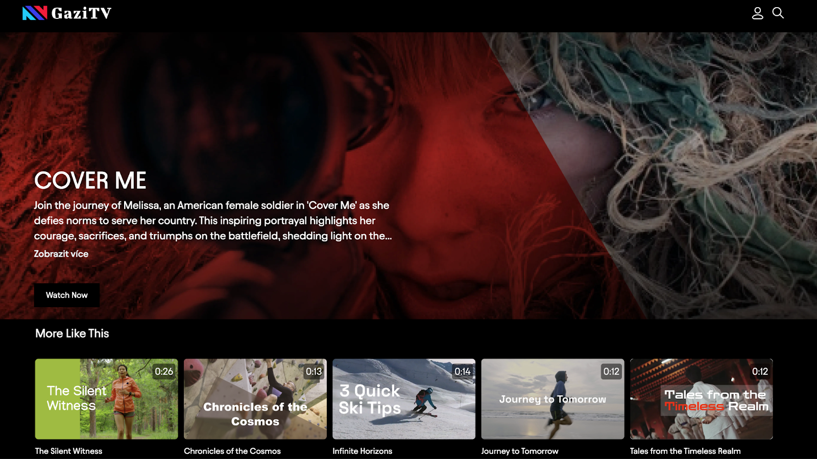
You can notice that the page layout is the same, the only difference is the banner and the media content.
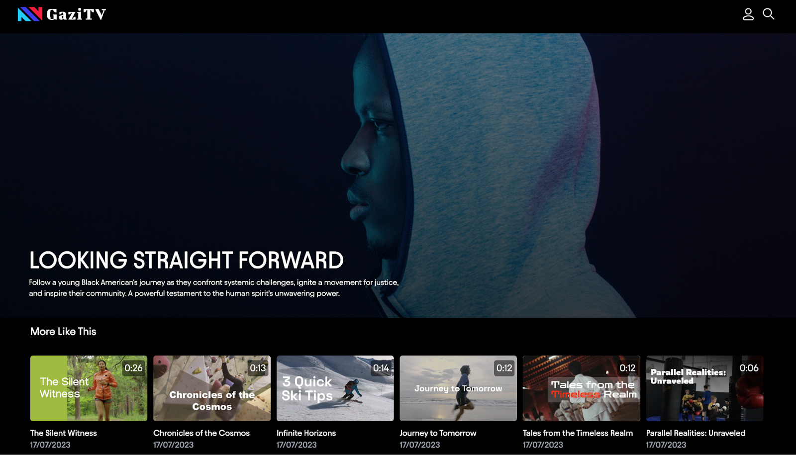
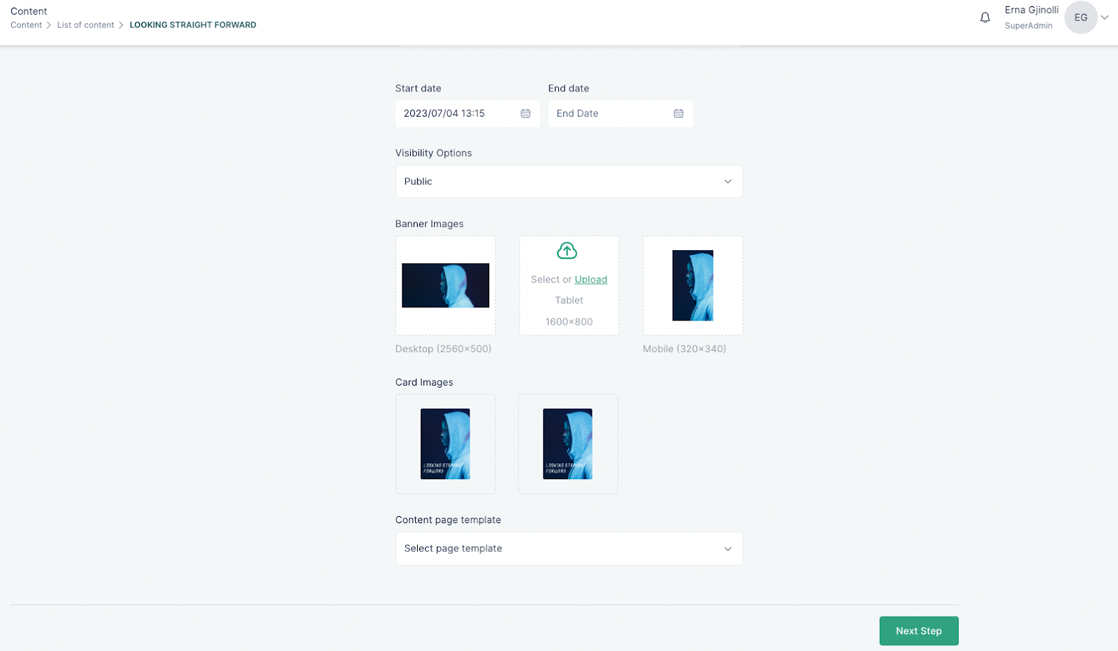
These banners can be uploaded on the editing page of each content
Banner Carousel
A banner carousel allows showcasing multiple images or content in a dynamic way.
To add a banner carousel to your page, do the following:
- Insert the Banner Carousel component into a page
- Select the static option if you would like this banner on a static page or a homepage
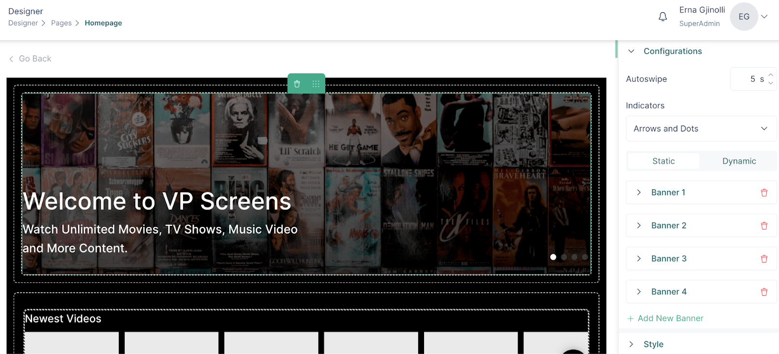
- You can add banners to the carousel by clicking on the “Add new banner”
- Clicking on a banner section on the right side, will open the banner configurations
- You can either insert an image or enable the video support on banner
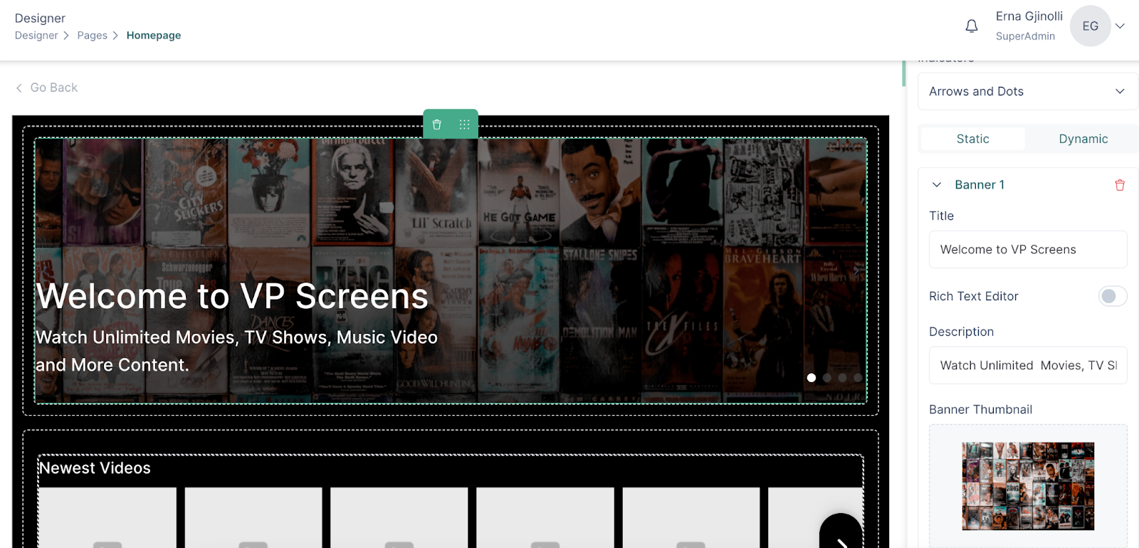
- You can choose the indicators which will be used to switch between the banners, and you can also set the Autoswipe feature, by setting the time between each swipe.
Button
A button is a UI component that can be added to a banner or inside a content widget
To add a button in a banner, follow these steps:
- Insert a banner to your page
- Drag and drop the button component inside the dropzone highlighted in green
- In the configuration write the text on the button
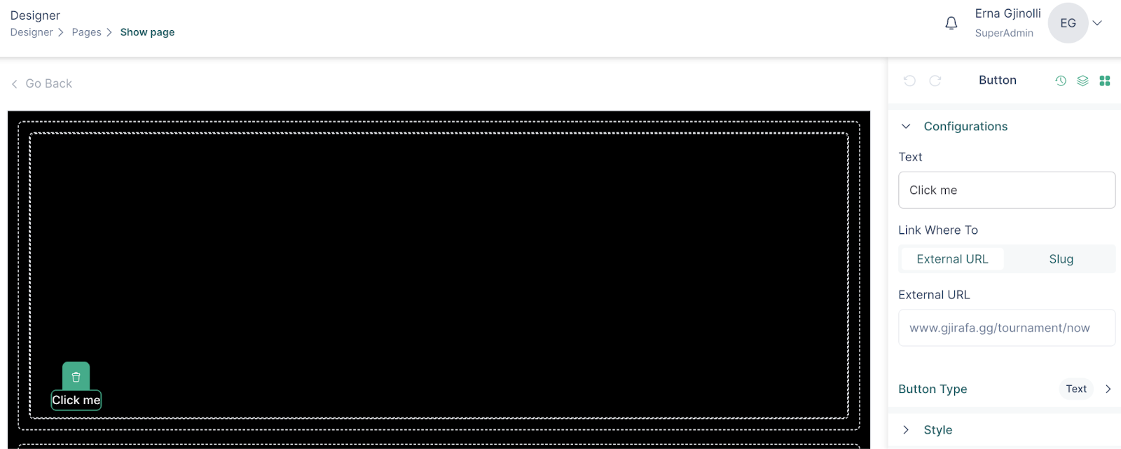
- Add a link to the button
- Add an icon to the button by selecting Icon or Icon & Text option
- Select an icon and style it in the Icon Settings section
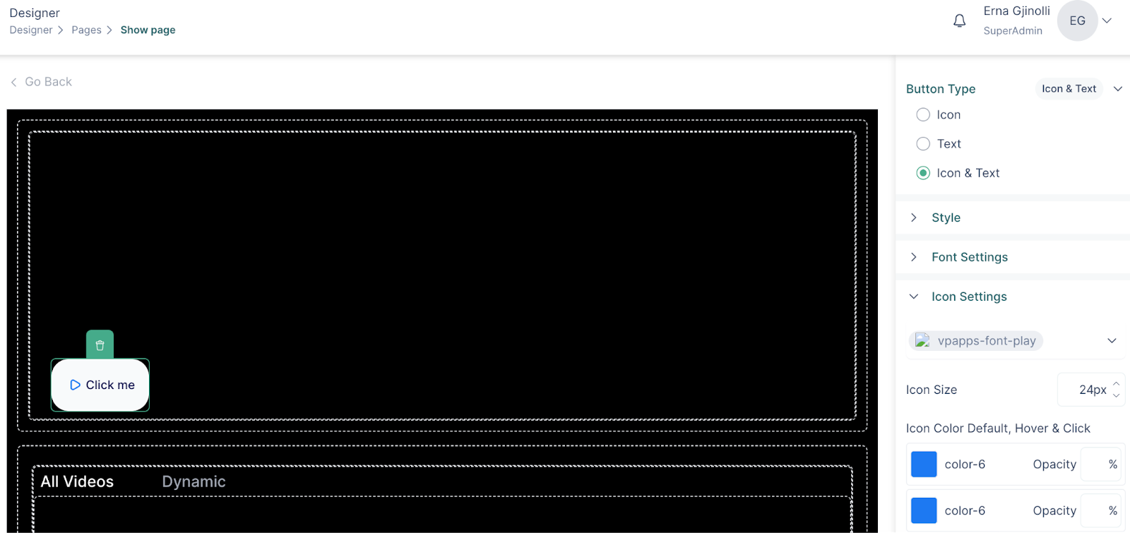
- Add borders to the button and style them
Below you can see an example of a button added to a content widget
A button cannot be added to dynamic banners
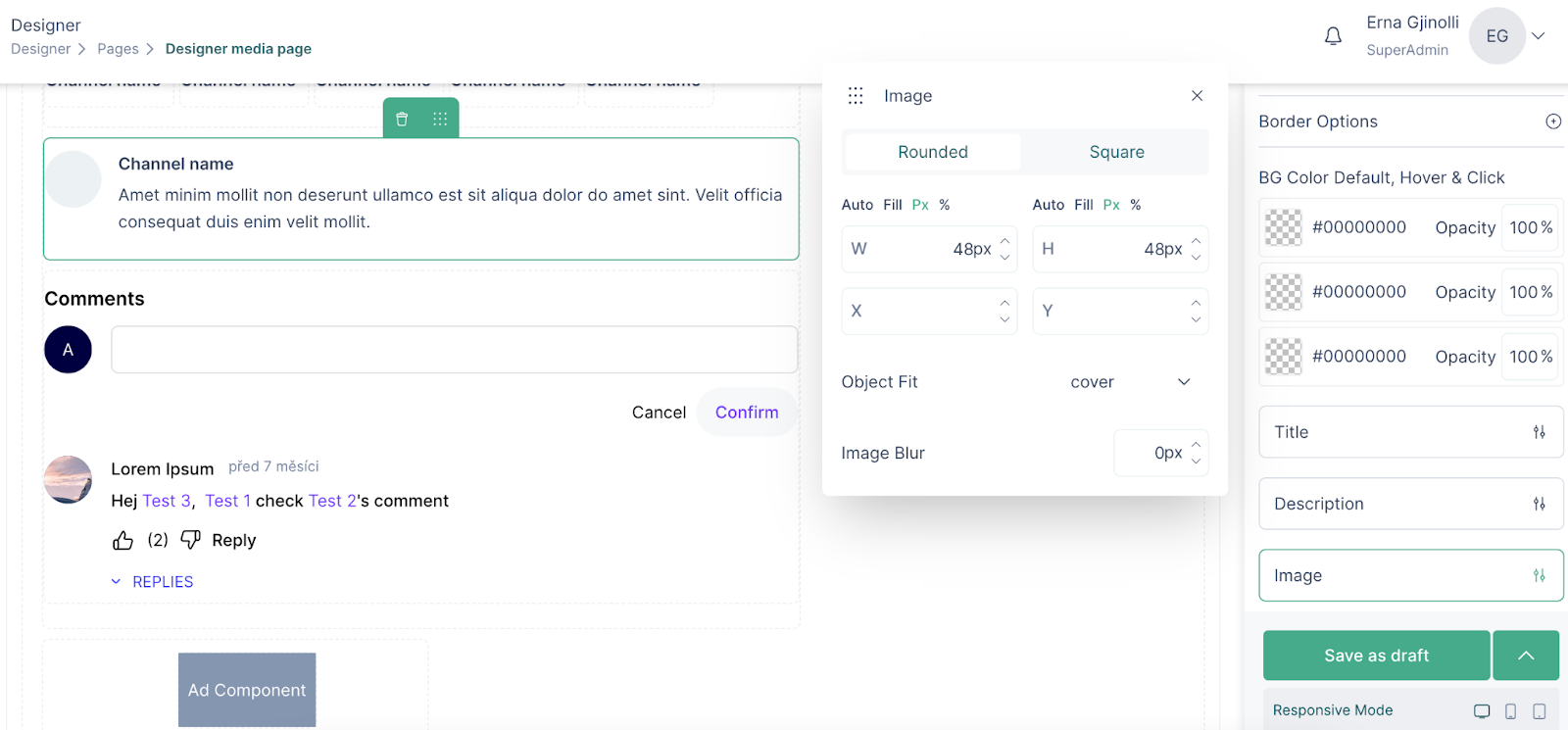
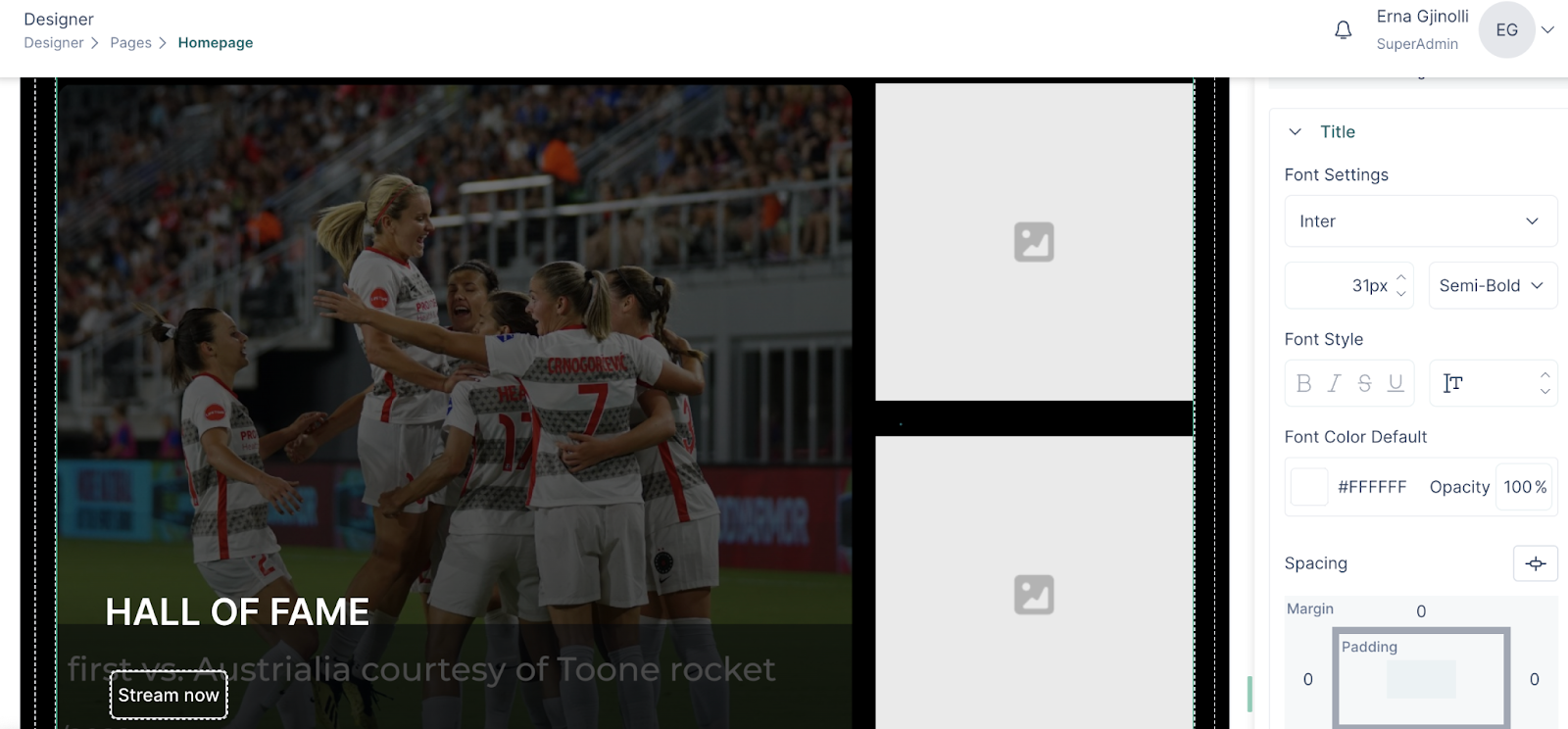
Image
An image is a UI component that can be used for designing pages. An image can be added to a column within a page or a tab.
To add an image to your page, do the following:
- Go to a page
- Drag the Image component
- Click on the image to see configuration and styling options
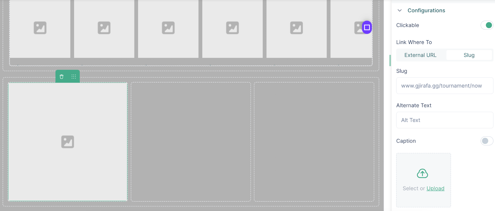
- An image can be clickable by enabling the “Clickable” option and then adding a link
- Upload an image and add an Alternate Text
- There is the possibility to also add a caption, by enabling the option
- Click on Save and then Publish to publish the image
Label
A label is a component which can be inserted inside a page, a footer or on the header
How it works:
- Drag the Label component inside your page, header or footer
- In the configuration field write the text of the label
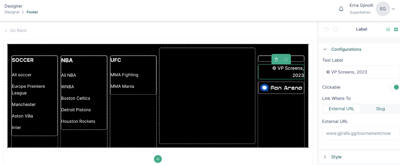
- To make the label clickable, enable the “Clickable” option
- In the style section, choose font color, font weight, style and size
Below is an example of the “by VP Screens” text inserted as a label on the header

Menu
Menu is a UI component that can be inserted within a header, page or a footer.
To insert a menu, do the following:
- Insert the menu component on your header, page or footer
- Click on the component to select a created menu
- For the menu added to a page, you can style the icon font and menu items
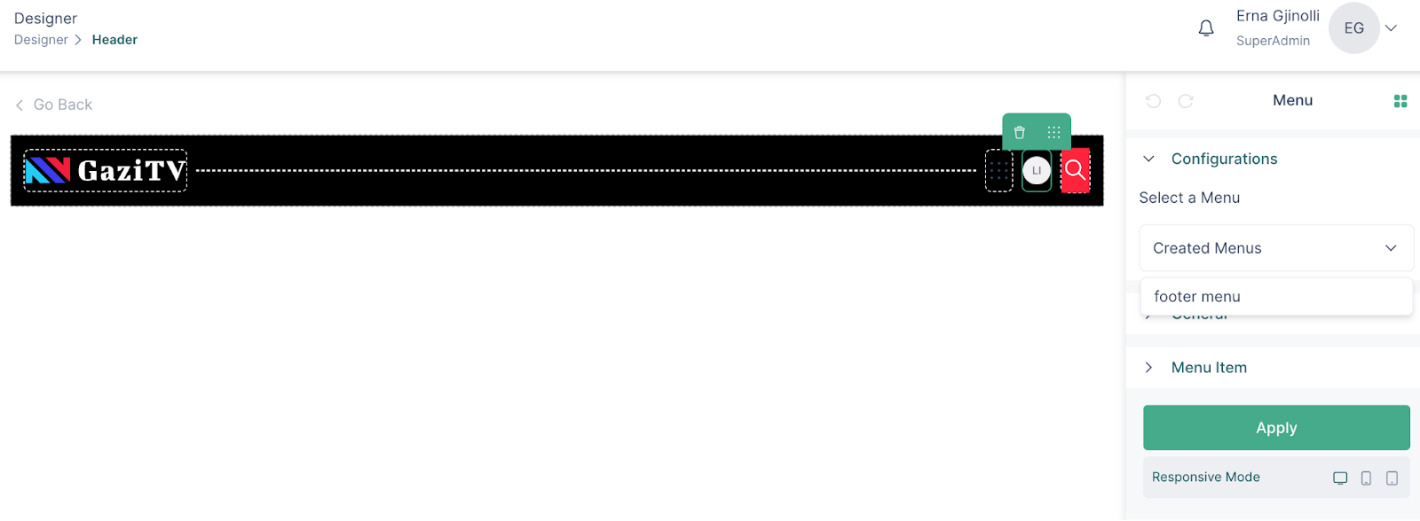
- Margin and padding options can also be applied to the menu component
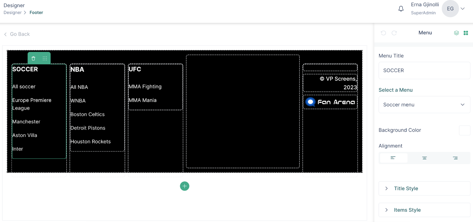
- Click “Apply” after every update to save the changes
Sidebar
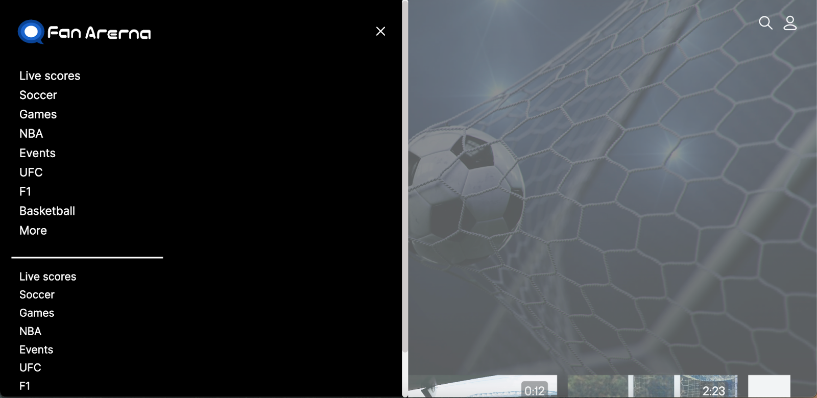
In order to add more flexibility and design options to a header menu, VP Apps introduces the ‘Sidebar’ component.
The sidebar component can be inserted in the header, and within the sidebar, the menu and spacing components are supported.
Here is how it works:
- Drag the sidebar component into the header
- In the General section, set up the width, height, spacing
- Click on the menu component, and select a previously created menu
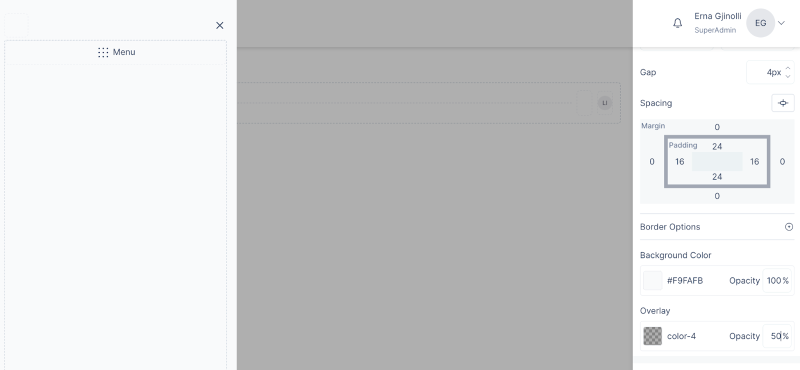
- A menu is added by default, to add another menu, drag the Menu component inside the Sidebar
- To separate the two menus, insert the spacing component and choose the ‘Divider’ option. Set its properties.
- In the General section, choose a background color for the sidebar, an overlay color with possibility to set the opacity, and add the desired margin and padding values for proper spacing.
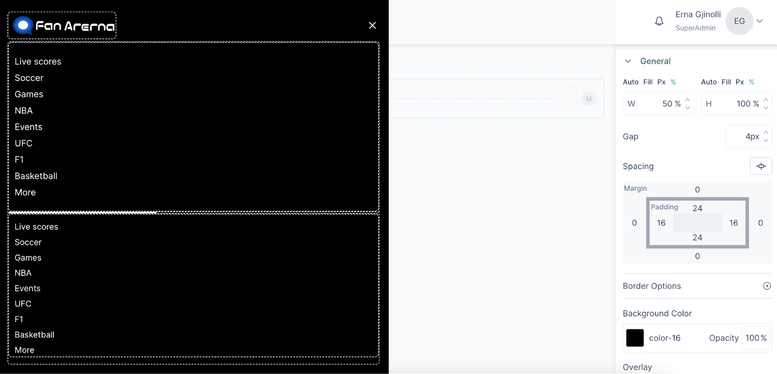
- In the end, you should be able to have a final look like the one below
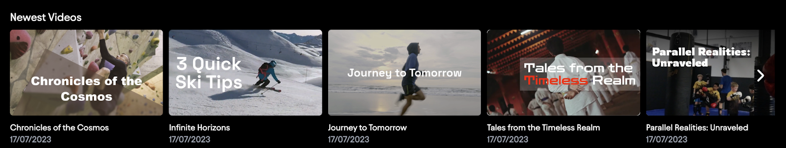
Newest Videos
The newest videos component is a special component which is used to display newest videos from other projects on the default project.
Rich Text Content
The rich text content component can be used to add additional styling to different paragraphs of a text. The rich text content can be inserted within a banner or a page.
To use the rich text content, follow these steps:
- Drag the Rich Text Component within a column of a page
- Write the text
- Highlight parts of text that you would like to add styling to
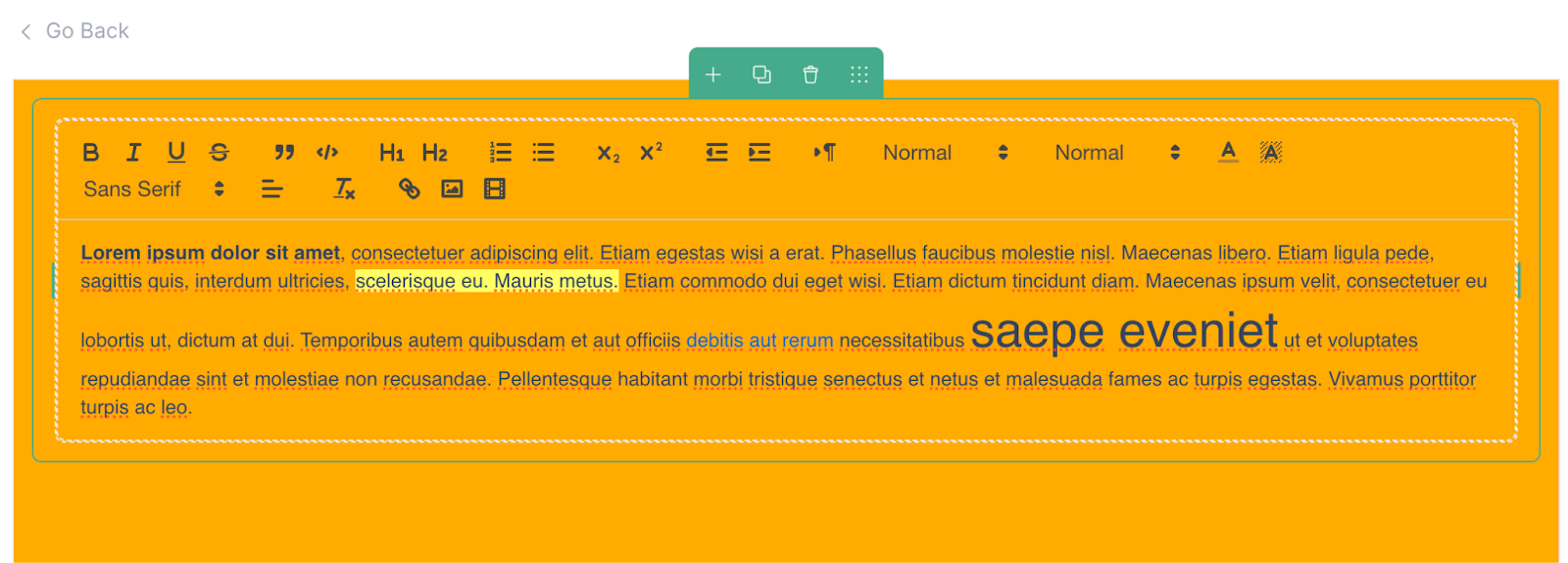
- The styling of the rich text content will be overwritten by the font styling selected on the right navigation bar.
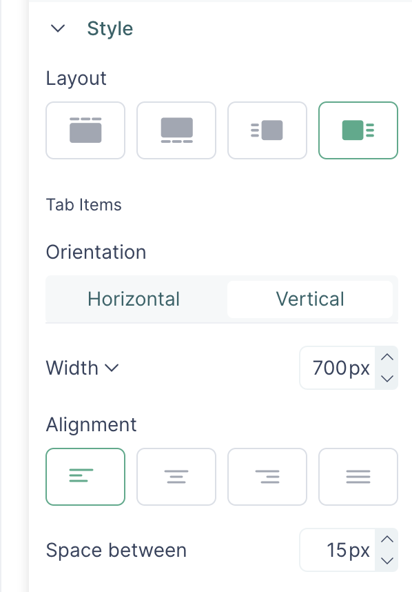
Tabs
Tabs is a UI component which is added to a page and within itself can contain other content widgets or banners/images
To add and configure tabs, follow these steps:
- Drag and drop the tab component into a column
- Click on the column to see the configuration options on the right side
- In the configuration section, you can enable changing tabs on hover. I.e without clicking on tab items
- Open the Items section, to add Static or Dynamic tabs.
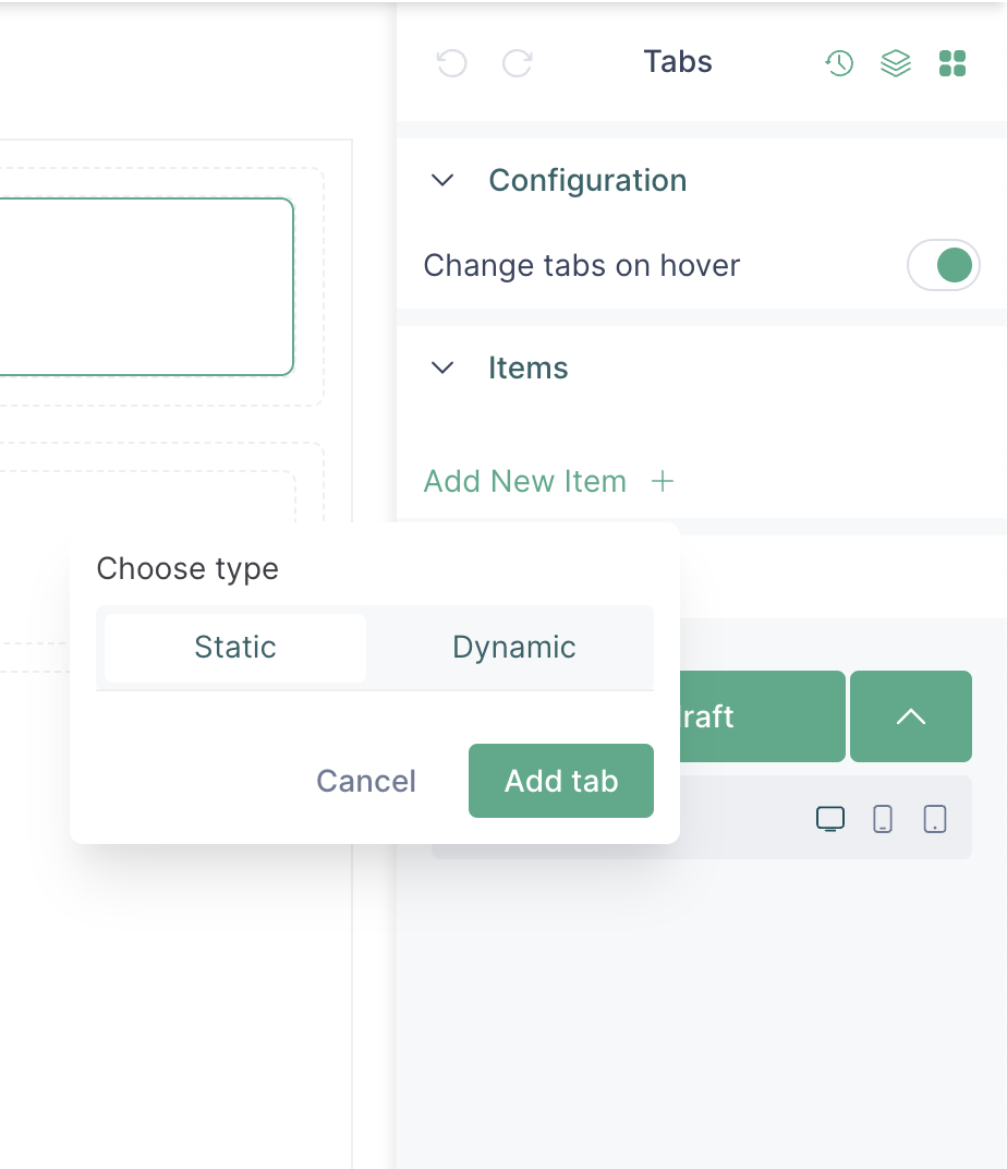
- In the case of a static tab, add a title
- Choose the layout of the tab
- Insert a content widget within the tab and configure the widget.
- In the case of dynamic tabs, the titles of the tabs will be added based on the configuration.
Player component
The function of the player component is to display the content in your platform. The player component is supported on the media page and the homepage.
On the media page, the player can be inserted anywhere via the drag and drop option and is usually coupled with the content details component so that the audience can see the media details.
On the homepage, the player can also be inserted anywhere, but there are additional properties which enhance its functionality.
For instance, a label can be added to the player, and if it is clickable, will then allow the user to be redirected to any internal or external link.
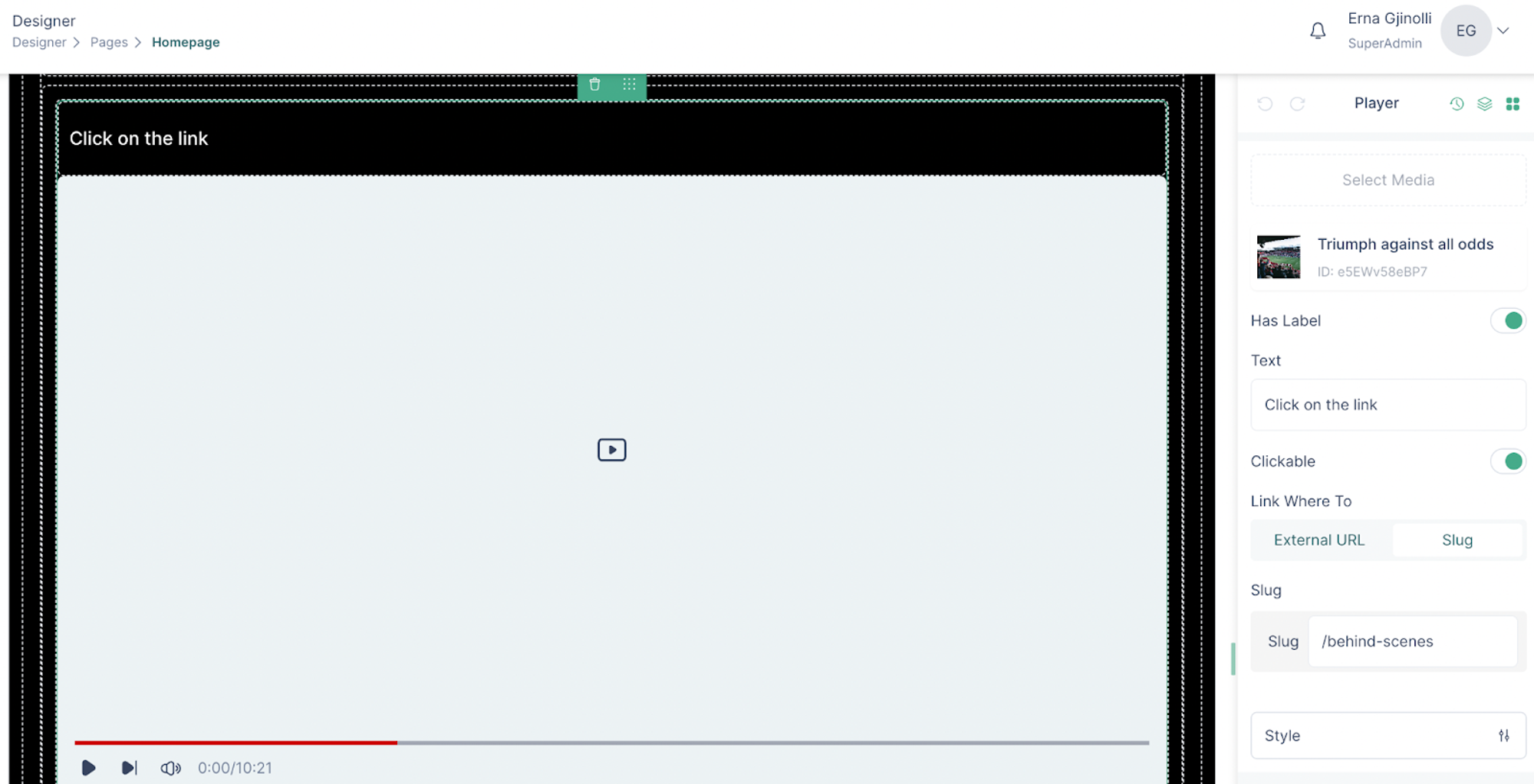
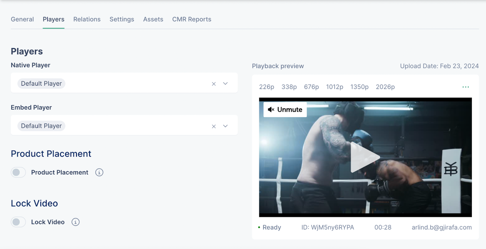
Player
In the players section, the native players and players used for embedding can be assigned to the media. In the dropdown, the imported players will be listed.
Apart from assigning the players to the media, on the Players section there are additional features like video locking and product placement label, which are described below.
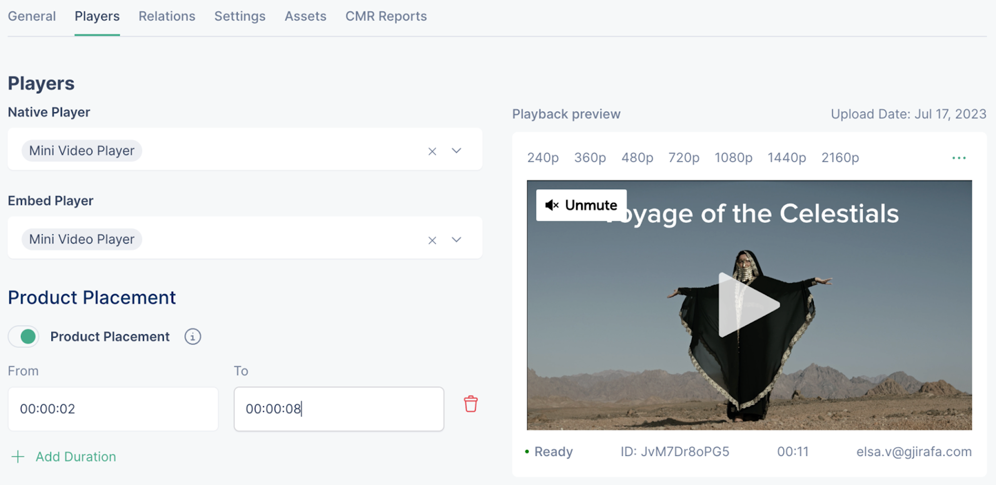
Product placement
The product placement feature displays a label on the player, which notifies the users that there is product placement in the video.
To display the product placement label, enable the Product Placement feature, and set the duration during which branded goods and services are featured in video content.
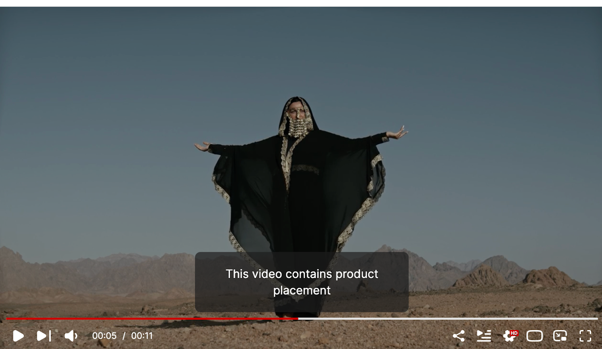
 And this is how it would appear to the end-users
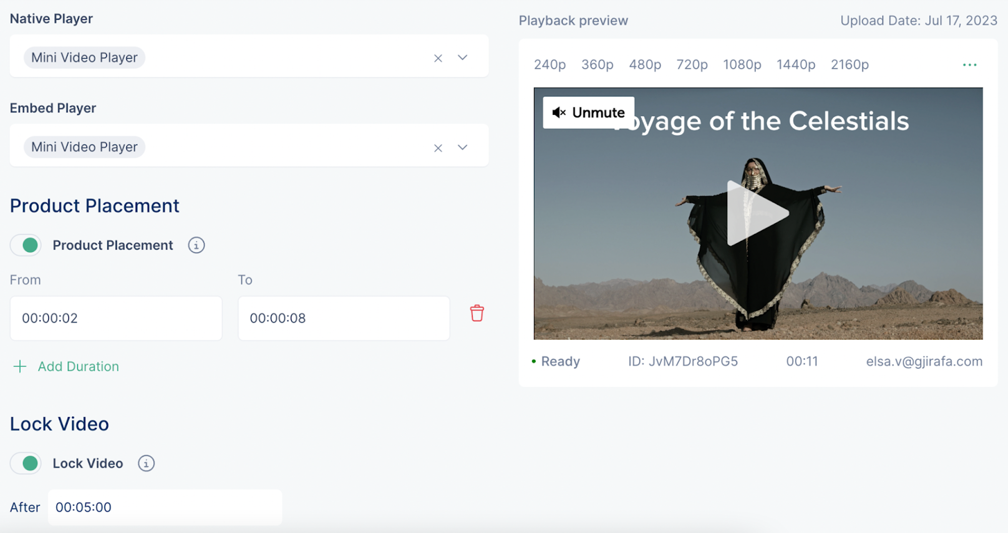
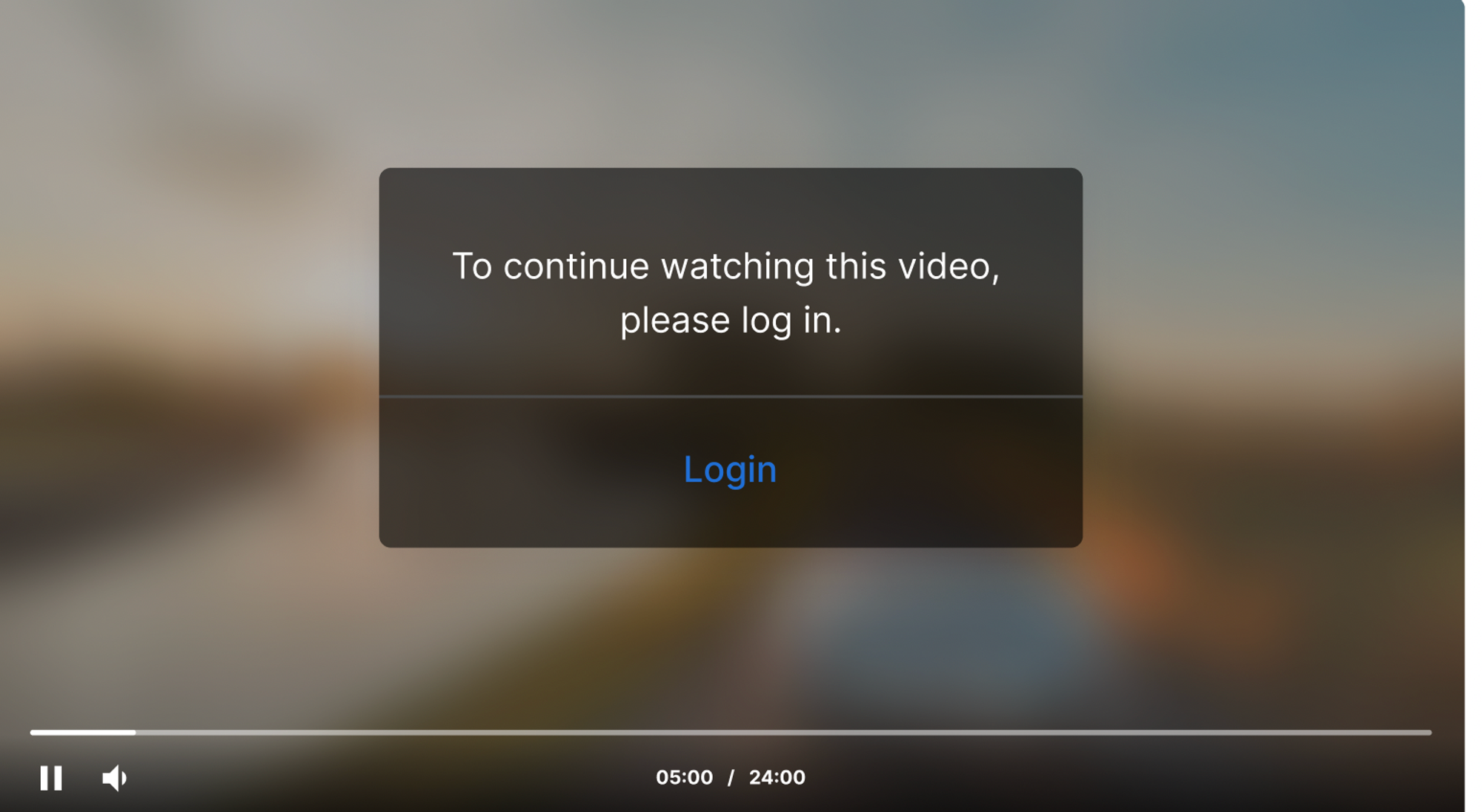
Video locking
The video locking feature allows users to lock their videos so that they are accessible only by registered audience members.
To lock your videos, enable the Lock Video feature and set the time after which the video will be locked.
 This is how it will appear to the unregistered audience:
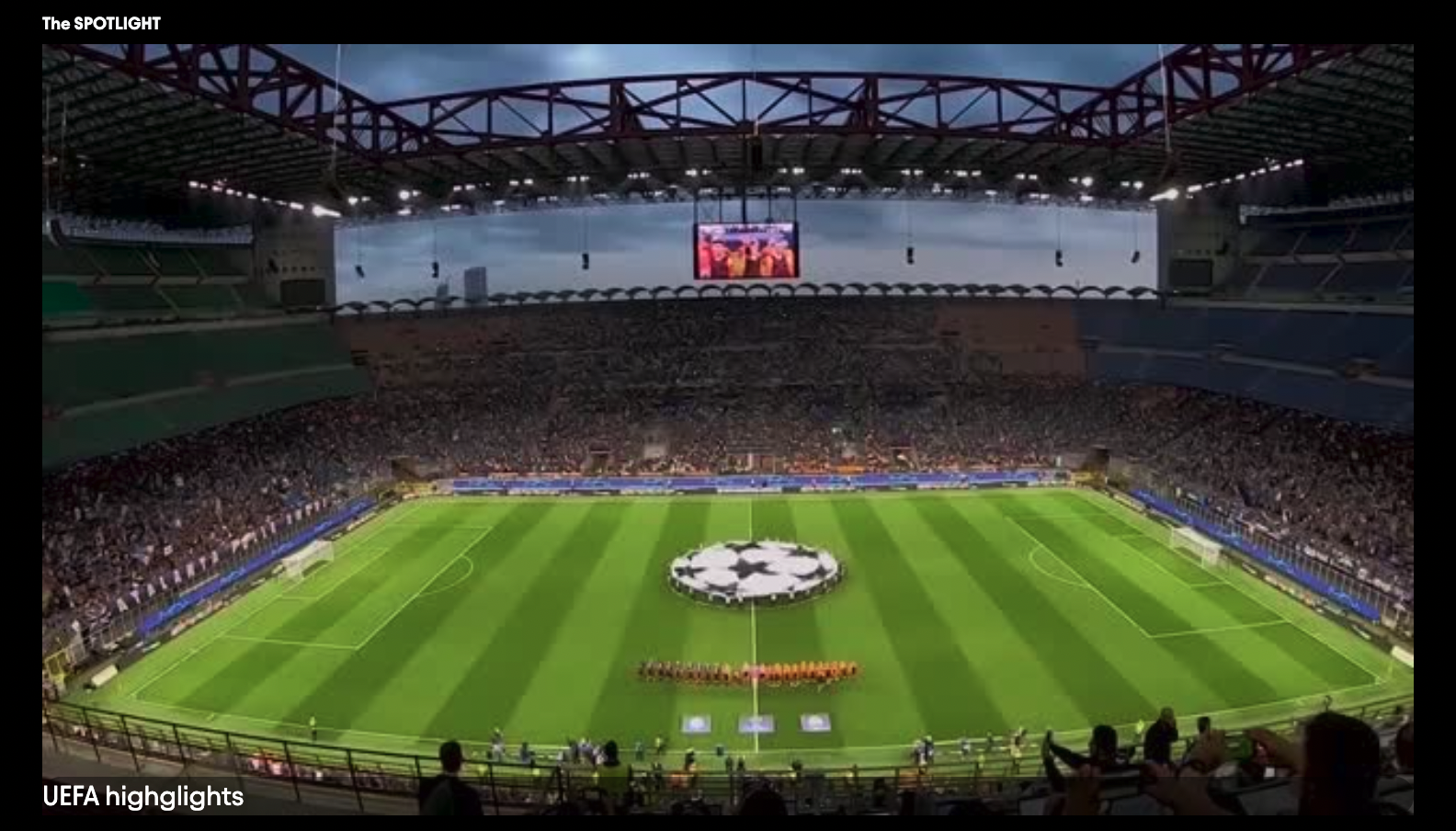
Navigation container
The tab below is left-aligned and has a vertical orientation. The items within the tabs are static and include banners for each item. The tab is configured so that the items will change on hover and users can see the corresponding banner when hovering over the items. This is an example of a tab used in a homepage which then redirects users to different sites through a click on the banner.
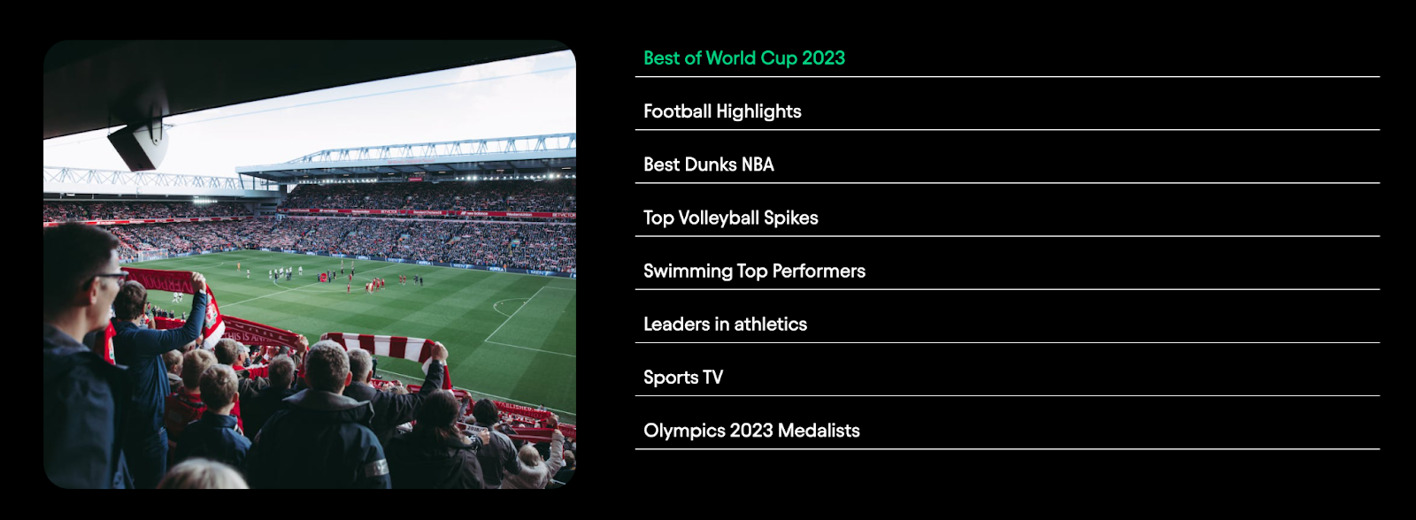
Content tabs
Tabs is a UI component which is added to a page and within itself can contain other content widgets or banners/images.
The example below is that of a content page where tabs are used to show off the content in different seasons of a show.
In this case, dynamic tabs have been used, whereby each content page has the items of tabs corresponding to the seasons of different shows.
To create the content tabs, content widgets have been inserted into the tabs and configured based on the group of the organization.
In the picture below, there is an example of a sports show, which uses tabs to display the videos of each season.
Media related algorithm
The related media algorithm gives users flexibility in the sense that they can select what groups of media will compose the following media on a media page.
How it works:
- Go to Project Settings and navigate to Media related algorithm page
- Click on the ‘Add group’ button and select from the options
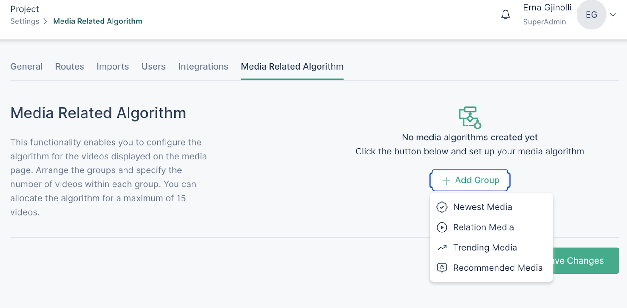
- After selecting the group, click on it to set the number of videos which will be retrieved from that group of videos
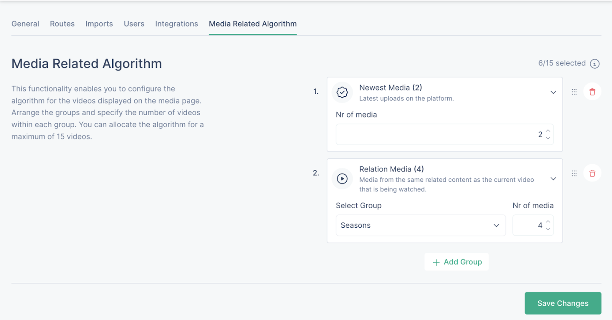
- Once the algorithm is set, click on ‘Save changes’
In order to use the relations group, it is recommended to do this configuration after the groups of the platform have been established and each media is related to the content of the group.
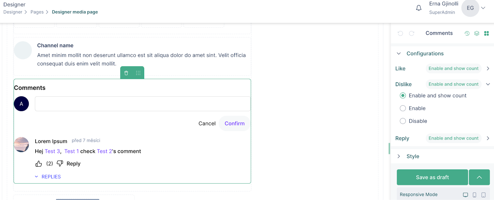
Comments
Comments is a component that is used on the media page to enable engagement for the web application’s visitors.
How to add comments to a media page:
- Go to the media page via the designer
- Insert the comment component into a column
- Click on the component to see the configuration and styling sections
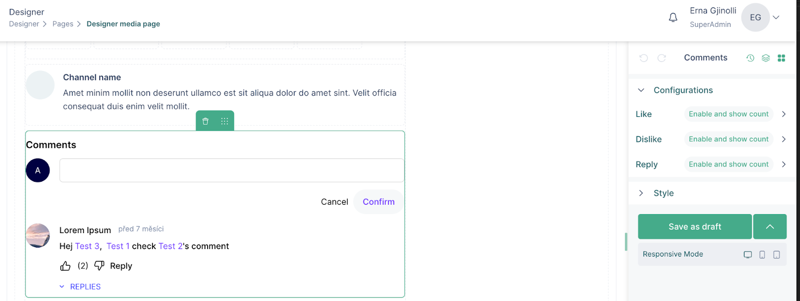
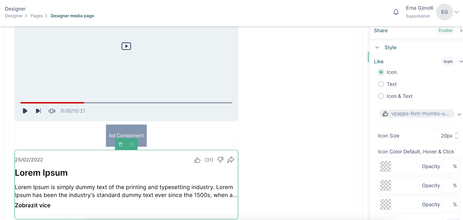
- The engagements for comments and replies can be enabled or disabled, and it is up to you to decide whether their count will show or not.
- In the Style section, you can choose whether the engagements will be shown as an icon, as a text or as Icon & Text.
- Furthermore, you can choose the icon for the engagements, set their size, and colors.
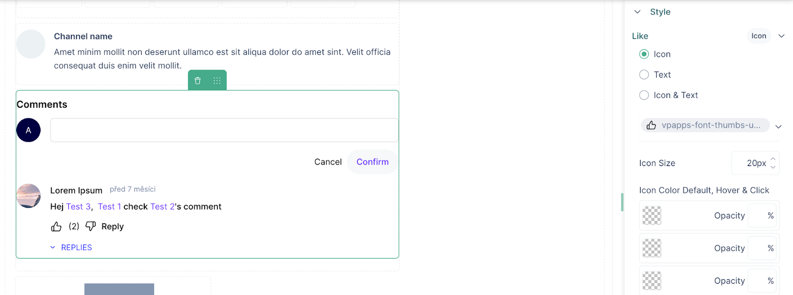
- After styling the icons, other parts of the comment component that can be styled include the Title, Account name, Comment, Primary and Secondary buttons.
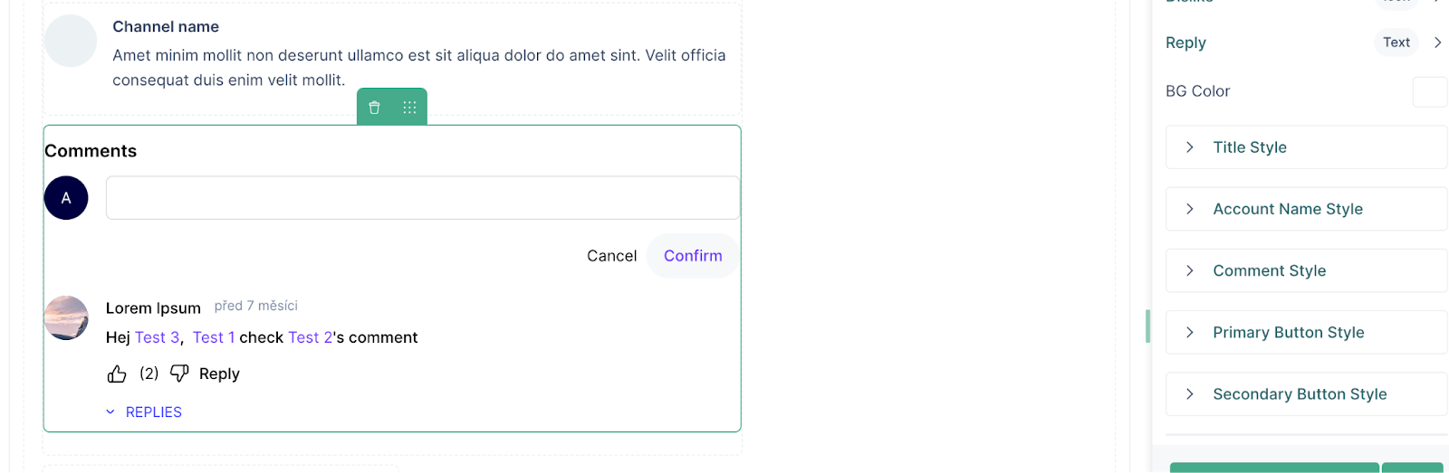
- Click on Save and then Publish to see the updates
Content details
The Content Details is a component in VP Apps that can be added on the media page, just under the player, so that the audience can see the details of the media that is currently being played. The components of content details include: title, description, engagements, publish date and viewers information.
To add the content details component, follow these steps:
- Drag the component inside a column
- Click on the component to see the configuration and design options
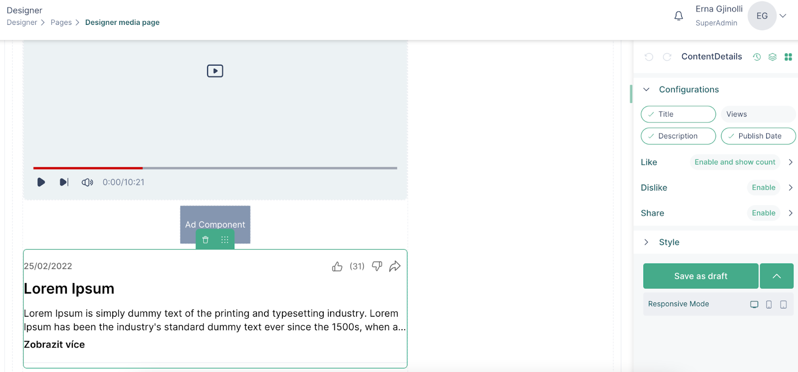
- On the first part of the configuration section, choose what information related to the video you would like to show
- On the second part you can enable/disable the engagements and also have their count be shown or not
- In the styling section you can choose whether the engagements will be represented by icon, text or icon & text
- Style the title and description
- Use the margin and padding options to set the position of the component within the column
- Click Save and then Publish to publish the page
Related group
The Related Group component is used to add information related to the group that a video is related to. It is where the name, image and description of content as well as engagements related to the group are shown for the audience.
To add the related group component to your media page, do the following:
- Drag the component and click on it to see the configurations
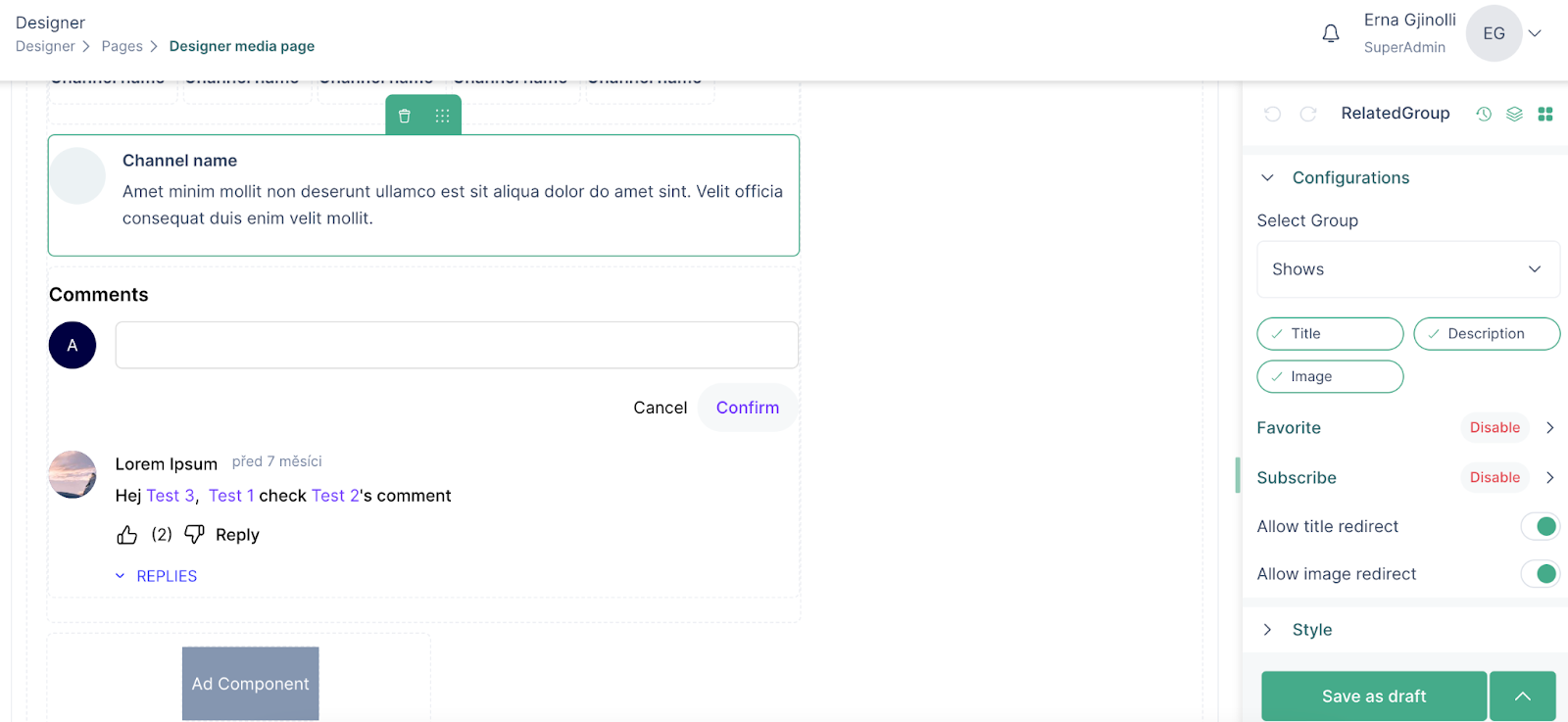
- Select the group the content of which you would like to show
- Set enable/disable group engagements
- Enable the “allow title redirect” and “allow image redirect” to redirect the user to the content page
- Style the title, description and image appearance
- Use margin and padding to set the position of the component
- Save the page and then publish it
Ad component
The ad component in VP Apps can be added anywhere on a page, which with the right configuration and an ad script can support monetization of the platform.
- Drag the ad component anywhere on the page and click on it
- Enter the ID and class name
- Add more fields by clicking on “Has child items”
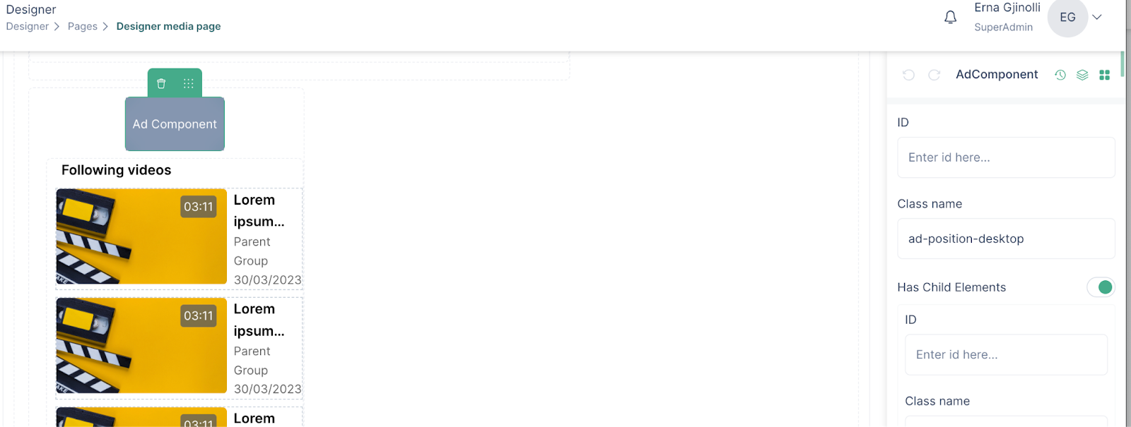
- Save the page and then publish it
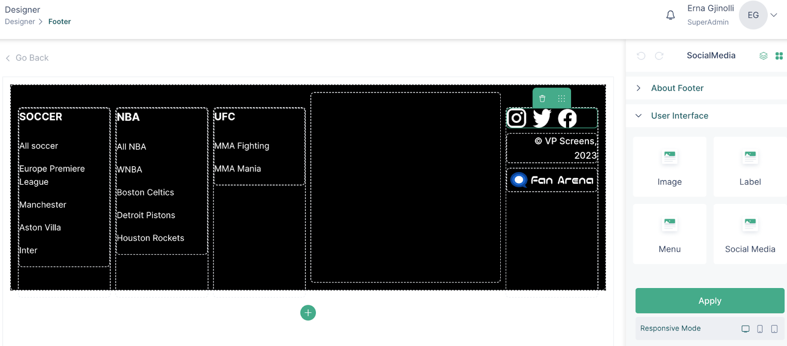
Social media
The social media component is used to add media links to your platform, which will then redirect the audience to your social media pages. The social media component can be inserted within banners or the footer.
- In the designer, drag the social media component within a footer or banner
- The social icons will appear provided that corresponding links have been added in Project Settings
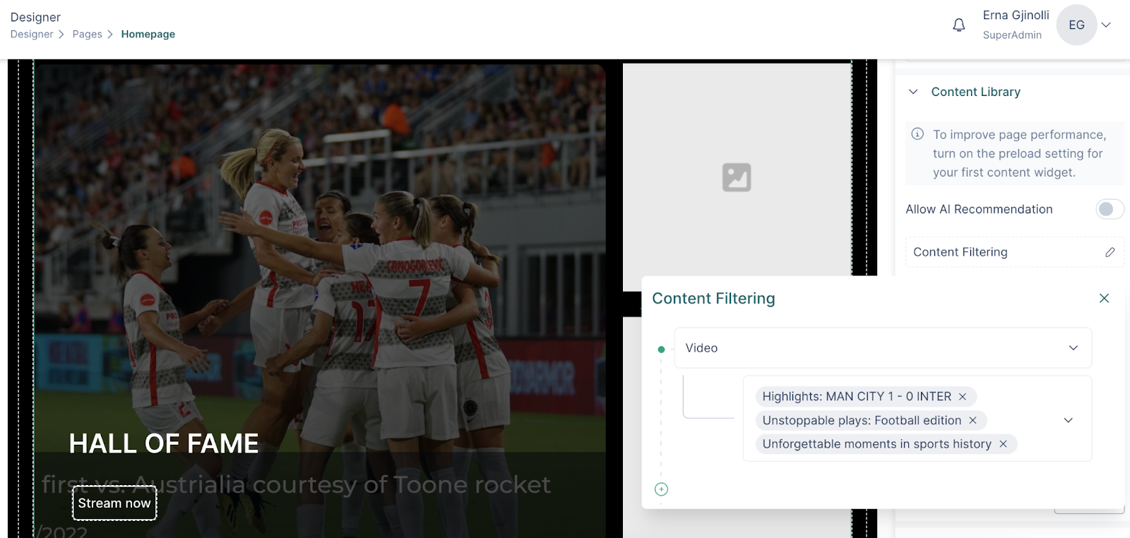
Building queries for widgets
The content widgets which are used for showcasing content throughout the website, require query building, which then allows for filtering the content based on the groups and the hierarchy that has been created on an organization level.
How building queries work:
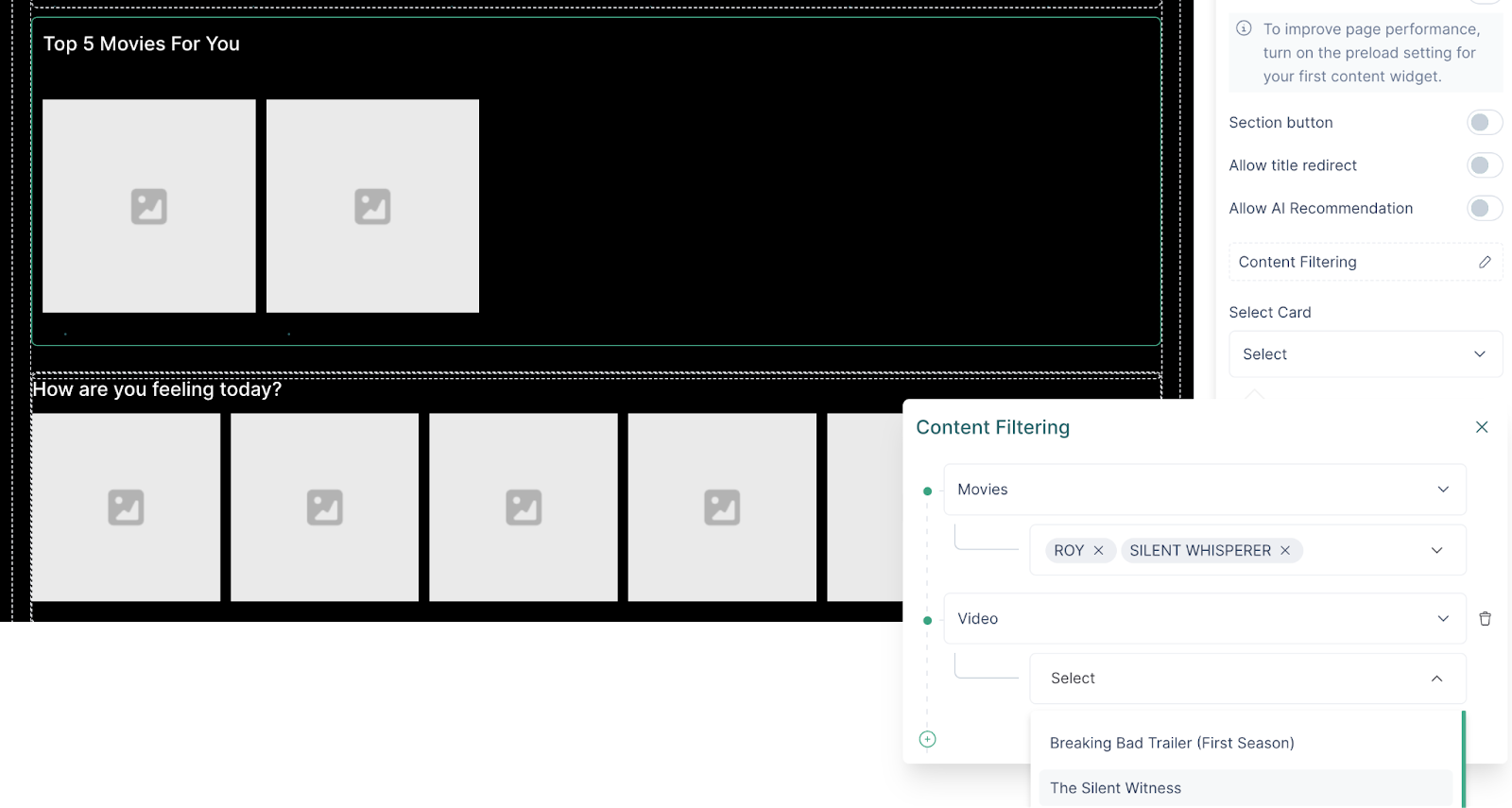
- In the configuration section of a content widget click on “Content filtering”
- Choose the group that you would like to filter your content with
- If you would like to filter the media from specific content within the group, choose the content(s) under the group. Otherwise, all the content will be included in the filtering.
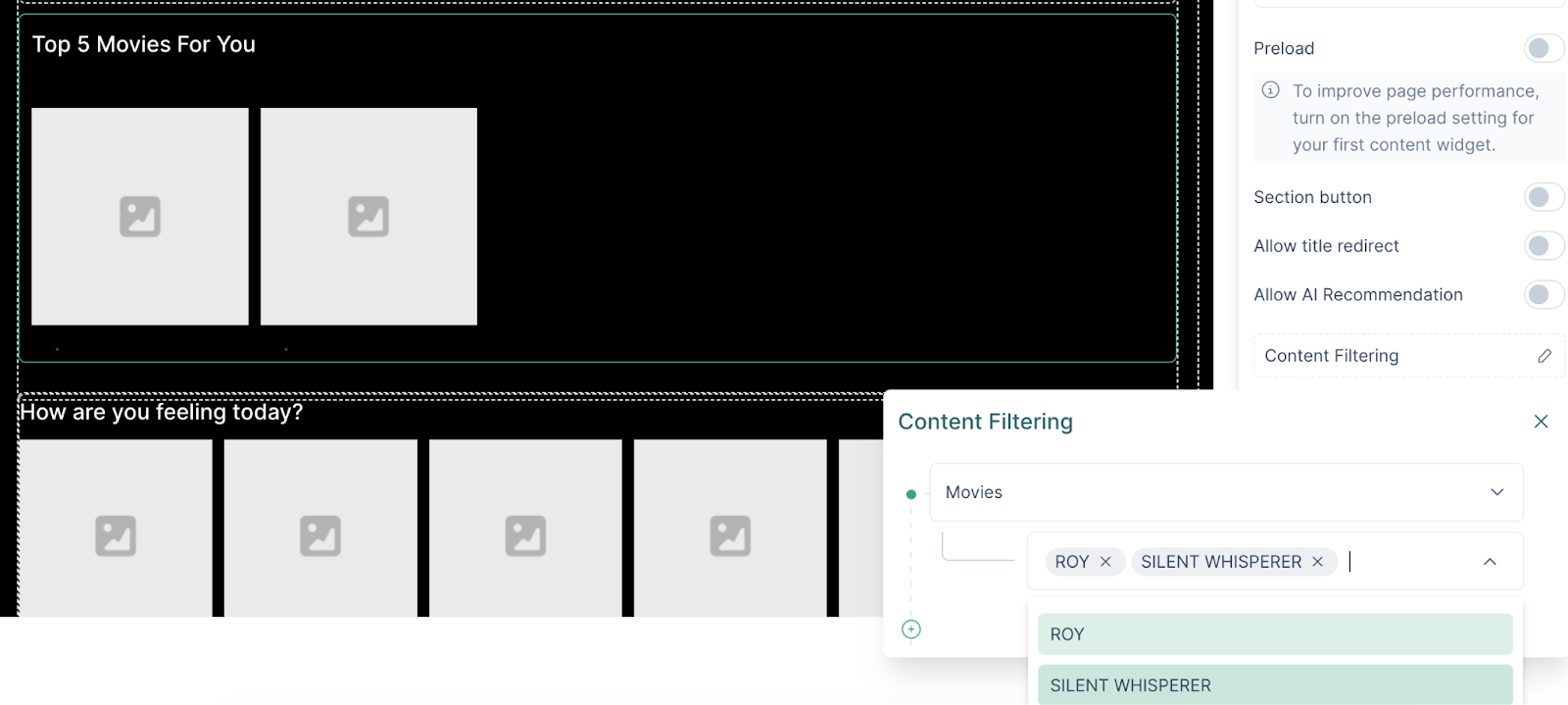
- Depending on what you would like to show, you can filter the content further by choosing the groups down the hierarchy
- Or you can directly go to the videos group, and all the media will be included in the filtering.
- To choose specific media, select them under the Video group.
AI Recommended Sections
AI Recommended sections are used to show relevant content to the audience, offer personalized content and encourage user engagement.
To create an AI section, follow these steps:
- Insert a widget within a column
- Click on widget and see the configuration options
- Enable the AI Recommender
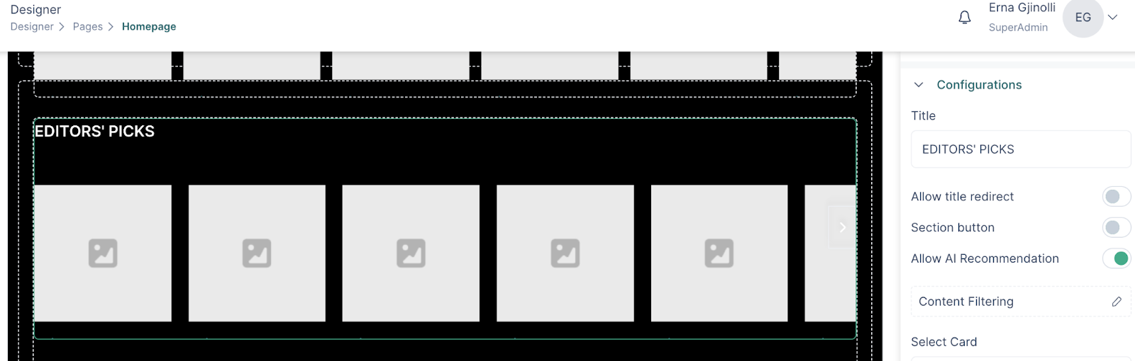
- If the AI Recommender during set up has included groups, those will be the ones shown for content filtering. This will help in getting recommendations from specific content
- If groups are not chosen during the AI Recommender set-up, the AI engine will still select relevant media and content to show to the audience, but it will include all the available content in the algorithm
- The configuration for the widgets will be the same as when the AI Recommender is not set up, so the procedure for building queries is the same.
Content Widgets
Content widgets are added to a page in order to showcase the content on the platform. The configurations include query builders and styling options.
In VP Apps, content widgets can be of different layouts and those can be found under different names in the components section.
There are 4 types of content widgets, which in principle work in the same way. The only difference is the layout.
Content widgets will have to be added within a column, but they can also be inserted within the tab component.
Load more’ button to reveal more content
This widget will allow for revealing more content as the user clicks on the button.
How to set it up for your content grid:
- In the configuration section of a content grid, click on the ‘Load more’ option
- Set the number of rows after which the button will show
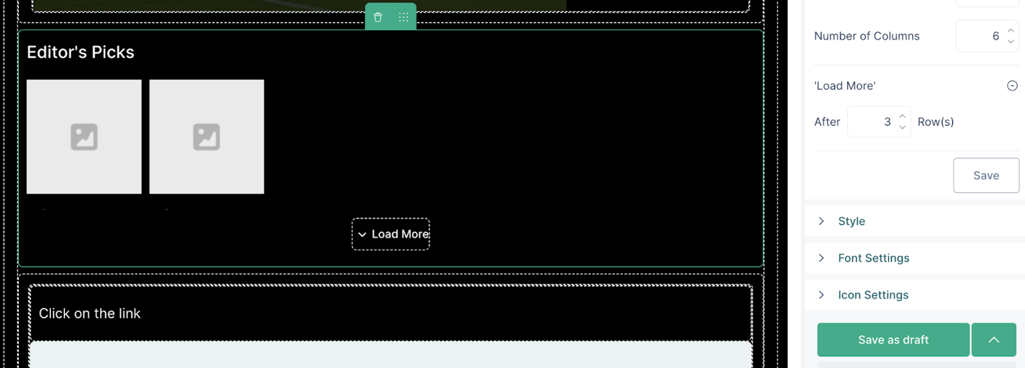
- Click on the button to view button configuration and styling options
- Save and Publish
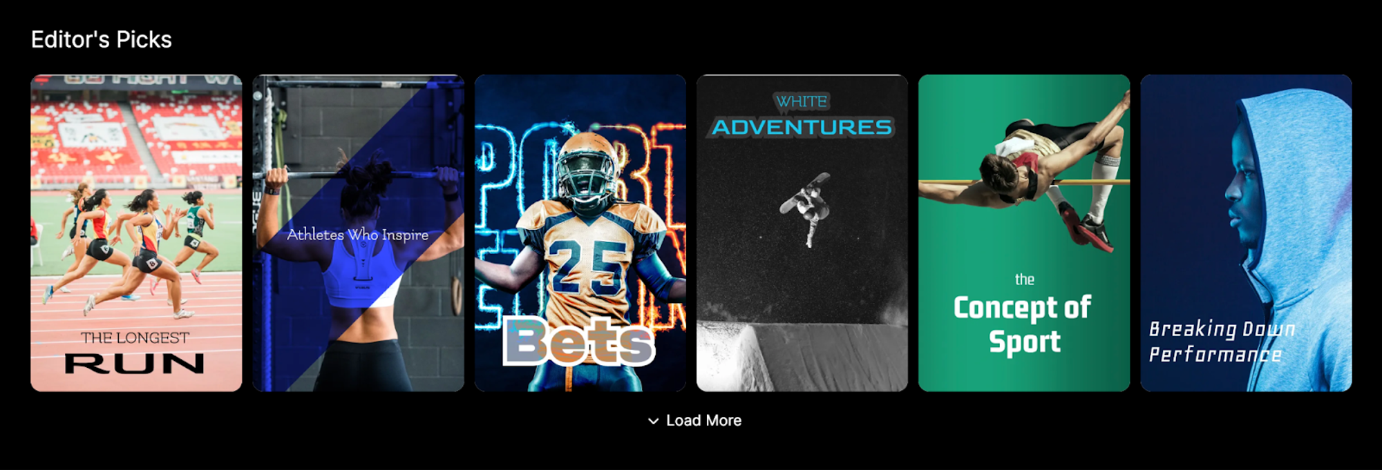
Content Grid
Here’s how to use a content grid to showcase content:
After adding the content grid into a column or a tab, click on the component to see the configuration and styling options on the right panel. The content library allows you to add multiple rows of content, which will be created based on the number of media.
- Add a title for your content grid
- Enable the title redirect, if you would like the end users to be redirected to another page. i.e a page with all your video content.
- In the configuration section, choose the groups or videos that will be shown on your content grid
- Choose the number of media that you would like to show, or enable infinite scroll for all available content to be shown.
- Choose the number of columns that you would like your content to be displayed in. In the font settings section, you can find options for styling the widget title.
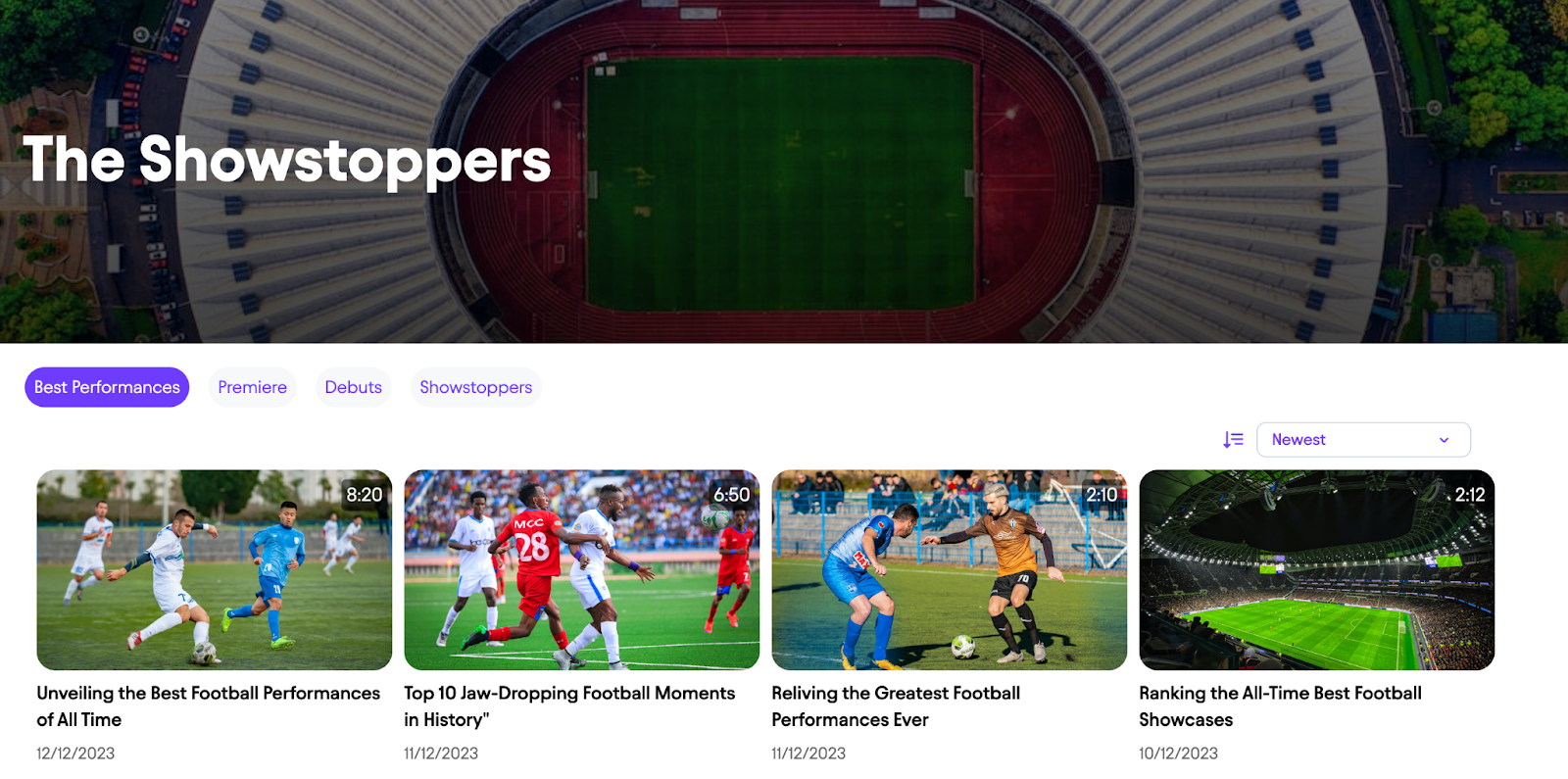
Content Carousel
The content carousel widget is different from the content grid in the sense that content will be shown in a single row, and the user will be able to go through the carousel via the scroll functionality. Content carousel works great for the mobile version.
Its configuration process is explained in the “Building queries for content widgets” section, in addition it will have the styling options for the scrolling icons, but in a platform would look like so:
Content Single
A single content component is used to give emphasis to a single media, and its best application is on a homepage, but it can be used in any other page.
Just like any other content widget, for the single content widget you can also add a title and style, as well as use padding options to set the position of the widget inside the column and properly space it in relation to other components in the page.
Content Slider
Content slider is also known as media carousel and its difference with the carousel widget lies in that a single media is in view when the user is scrolling. Similarly, it will utilize the scrolling icons which can be chosen in the styling section of the widget, and its configuration is identical to the other widgets.
Showcase Widget
The Showcase Widget is a combination of a banner and content grid in one. The Showcase Widget would best be used when there is new content and it needs a component to showcase it right.
Here’s how you create a showcase widget:
- In the Page designer, drag the showcase widget within a column.
- In the configuration section, choose the layout for the widget based on the position of the grid and the banner
- The width applies to the content grid, which then lets the banner take up the rest of the space
- The Banner section allows for the general configuration of the banner, which is identical to the procedure described in Static and Dynamic Banner section of this user guide
- Further, add a title and description for the banner, style the banner, add a button if you would like to
- In the Content Library section, configure the widget so that specific media are shown, or other media are shown based on the sorting methodology. Besides the banner, a maximum of 4 media can be showcased
- Styling the Content Library means that you can add spacing between the media as well as spacing to the widget in relation with other components of the page
- If you would like, set a title for your widget and style it so that it grabs the audience attention
- Click Save and then Publish
Save as Draft Preview and Publish
Saving a page
After designing a page, make sure to click on the “Save as draft” button. This allows for going back and picking up without losing any progress.
Page preview
Previewing a page has its advantages as it eliminates the need to publish the page after every update, allowing to quickly assess the progress of the design.
However, it is necessary to publish the page the first time after it is created, to be able to preview it afterwards.
Publishing a page
Publishing a page means that it will be pushed to the client side, and the end-users will be able to see it as it has been designed.
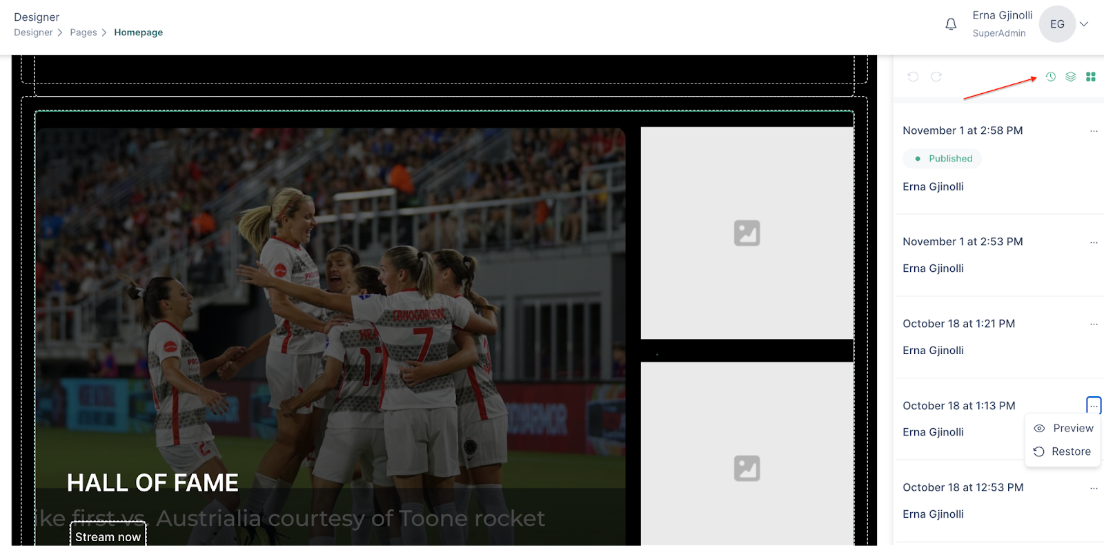
Restoring a page version
The restoring feature for pages, helps to safeguard against accidental changes or deletions.
To restore a page, do the following:
- Access the page through the designer
- In the right navigation bar, click on the “history” icon
- Through the preview feature, find the version that you would like to restore
- Select “restore”
Sorting methodologies
Sorting methodologies that can be used for the content in VP Apps are the following:
- Newest to oldest
- Oldest to newest
- A-ZA
- Z-A
- Most watched (trending)
- Relevancy (AI)
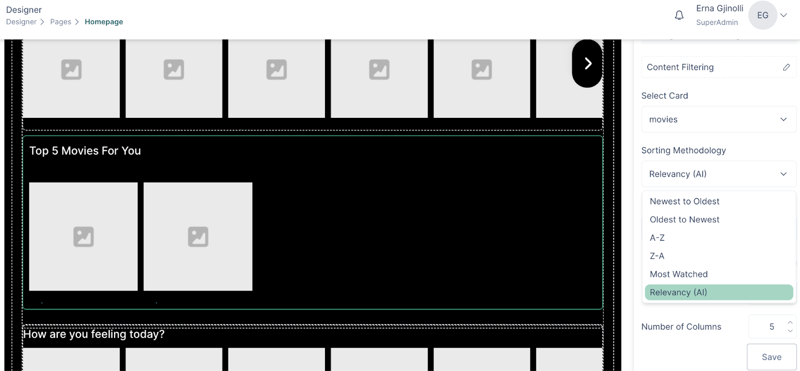
To access the sorting methodology:
- Click on a content widget that is already inserted in the page
- Configure the content widget
- Select the methodology
Sorting methods
The sorting methods options allow the audience to choose the way the content will be sorted for them.
To add the sorting options to your page, follow these steps:
- Click on a content widget
- Configure the content widget
- Choose the sorting methodology
- Click on Sorting Methods to reveal the options
- Choose one or more methods
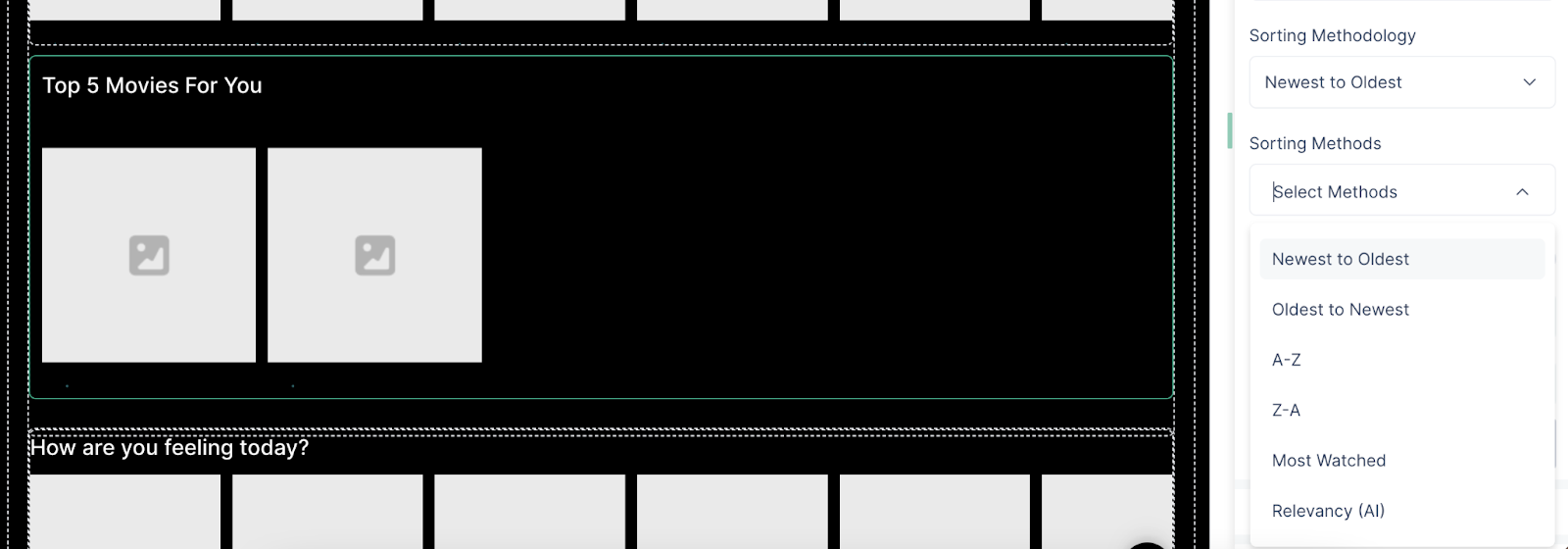
- The chosen options will be the ones that the audience can choose to sort the displayed content
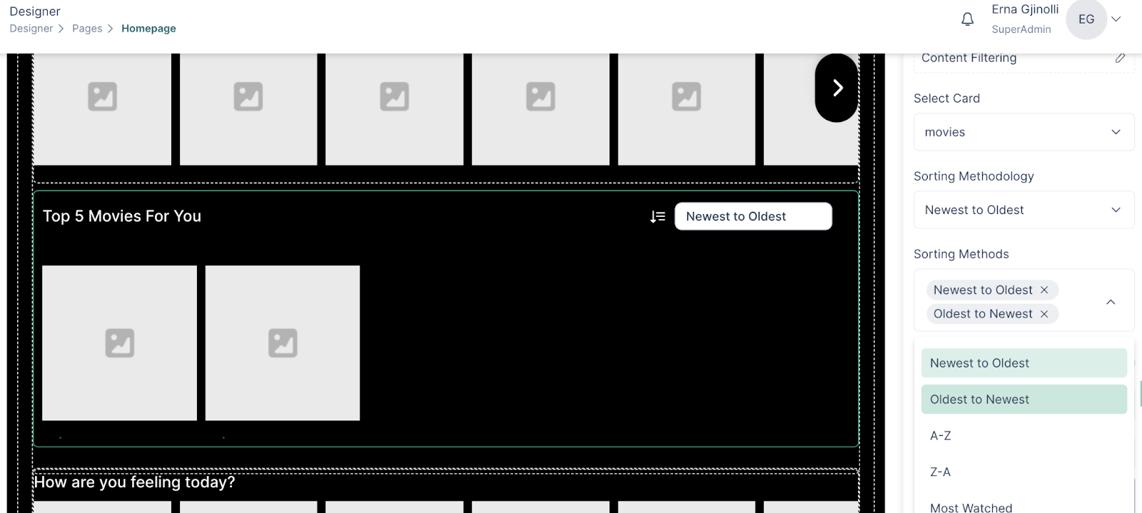
- You can style the icon and the box in the styling section.